Table of Contents
Quality Service Guarantee Or Painting Free

Get a rental agreement with doorstep delivery

Find the BEST deals and get unbelievable DISCOUNTS directly from builders!
5-Star rated painters, premium paints and services at the BEST PRICES!
Loved what you read? Share it with others!
Interior Colour Combinations for Homes in 2026
Published : January 31, 2025, 12:00 AM
Updated : February 6, 2026, 1:08 PM
Author :
![]() ANANTH
ANANTH
Table of Contents
After the year that 2026 was for all of us, we all hope that 2026 will be much better. Now, of course, there is no guarantee that 2026 is going to be pandemic free, but at the moment it looks like we can be a bit hopeful. But no matter what happens pandemic wise, a good home interior colour combination is key, we’re spending more time at home and desperately need it to be a place of peace, calm, and joy. In this blog we have added a complete guide for interior colour combinations for Indian homes in 2026.
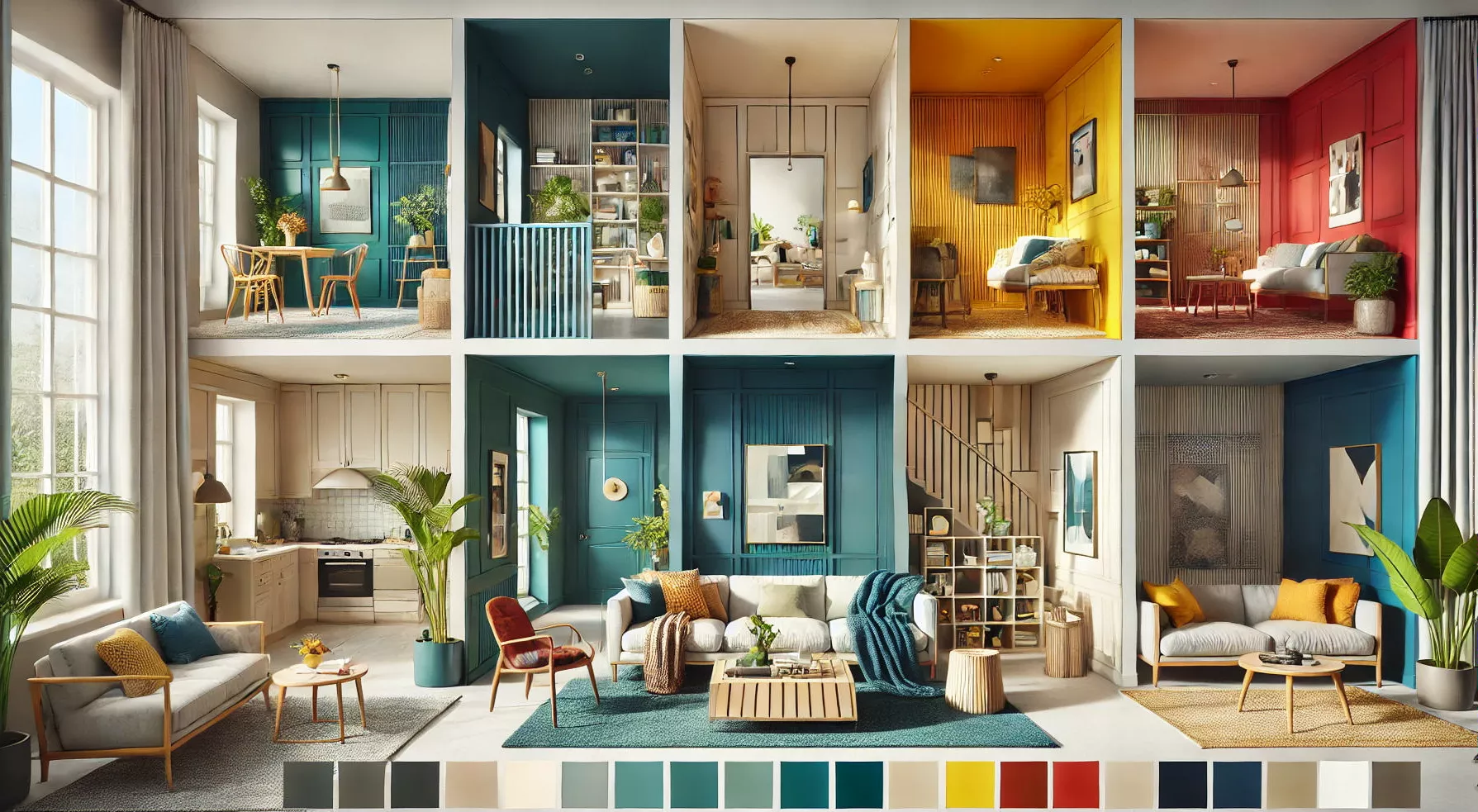
So, while choosing new home interior colour combinations, it’s always nice to look ahead and see what new interior trends are up and coming. Interior colour combinations can indeed make your house the ‘it’ house on the block, so choose wisely. Interior colour combinations for Indian homes have never been as much at the forefront as they are now. Especially since we are still spending more time at home, you might as well make your home look beautiful, with trendy home interior colour combinations.
Many paint companies are releasing their colour trends for 2026. With most brands, you can see the impact the Coronavirus has on the colour trends for the year. The overall theme of all these colour trends is creating a home where we can relax, recharge and feel comfortable. We see a lot of warm serene colour hues, from soft pastel tones to serene blues and greys, to create a calm base from where you can pick to decorate your home. But there is also a trend for more bright coloured hues to add more colour and cheerfulness to your life. So, this year's colour pallet, well it’s a nice combination of calm hues with a nice bright pop of colour sprucing interiors up.
Quality Service Guarantee Or Painting Free
Get a rental agreement with doorstep delivery
Find the BEST deals and get unbelievable DISCOUNTS directly from builders!
5-Star rated painters, premium paints and services at the BEST PRICES!
Colours for Kitchen Interior Design
Olive Sprig
Dulux colour experts have chosen Olive Sprig, a bolstering shade that connects back to nature and the simple things. A warm, earthy tone, creates a feeling of stability, growth and potential; and provides a firm foundation for change and creativity in your home. Having an inviting home interior design for kitchens can also make the space more homely. Kitchen colour combinations are also the talk of 2026 as many people have taken up to cooking over the lockdown.
Elegant, grounded, versatile and highly adaptable, the grey-green colour represents regrowth, mimicking nature’s resiliency. Olive Sprig can help create a sanctuary in a bedroom, or pairs beautifully with brass accents and wood tones on an island or lower kitchen cabinets.
Picking exciting kitchen interior colour combinations has long been a fad, and was done by mixing several shades to get ‘that ideal shade’. Brave Ground is a colour that can easily be combined with other hues and can help bring out the best features in your kitchen.
Be Well
This trend celebrates the beauty that comes from living with wellness as a priority. So, the main focal colours are shades of forest green with accents of marble sprinkled around.
Be True
This palette tells a story that celebrates authenticity and connection by featuring the artisan’s touch and renewing traditional know-how. With key features of black and white, this pallet is bound to spruce up your kitchen.
Be Wild
Embracing joy, this paint colour trend has a mood-boosting mindset with energetic colours and grounding neutrals to inspire you. If you look at the cover of a couple of national geographic magazines, you’ll see how this colour takes inspiration from the kings and queens of the wild.

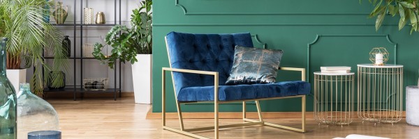
Colours for the Living Room Interior Design
Expressive Colours
Plants in house interior designs are always a focal point when you decide to renovate., For the living room colour combinations that have expressive colours are key this year, with jewel tones shining bright.
Optimistic View
A pop of bright colour lifts the mood in any space, making it great for kitchens, playrooms and anywhere you want to feel energized.
Outdoor Escape
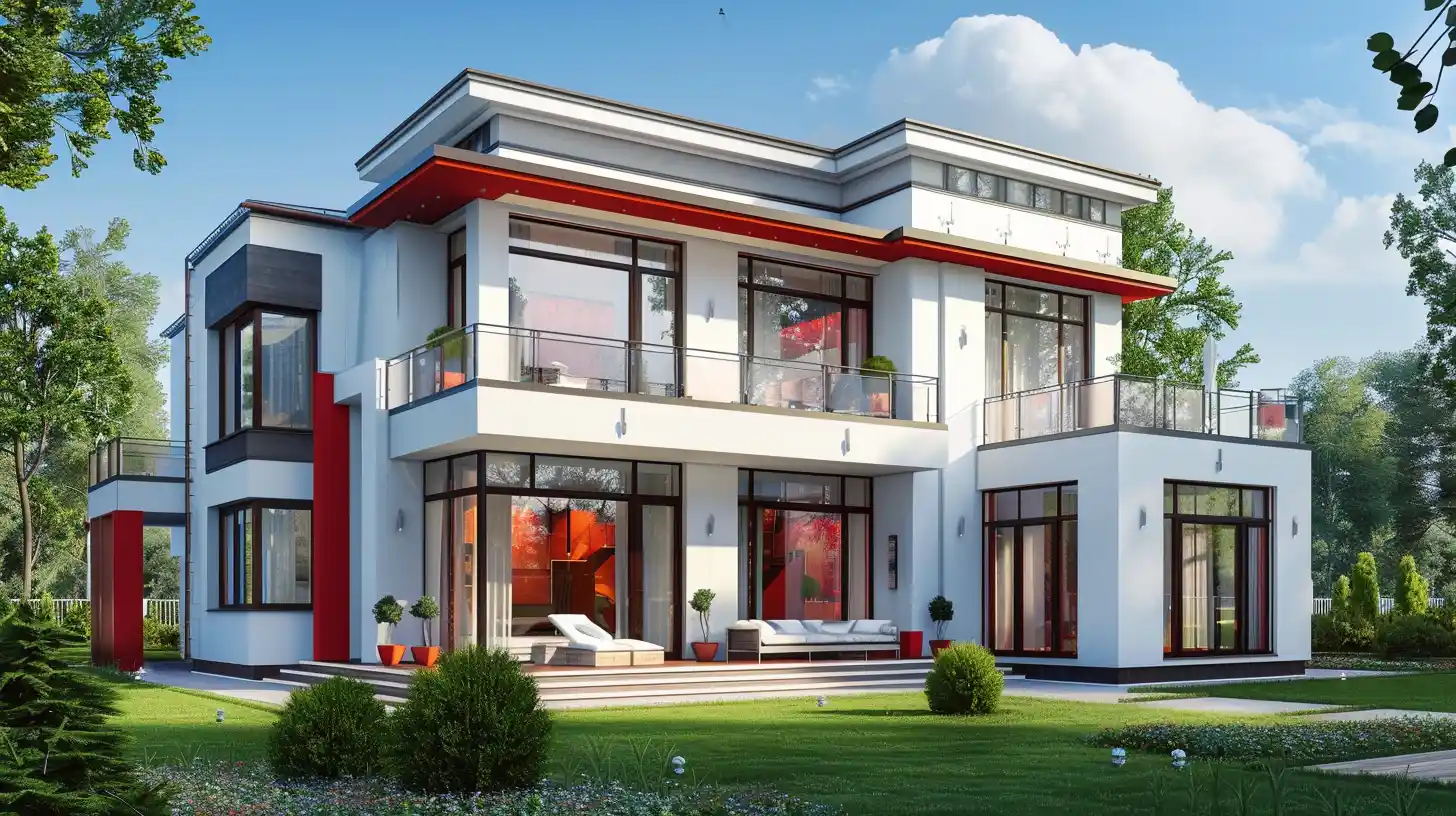
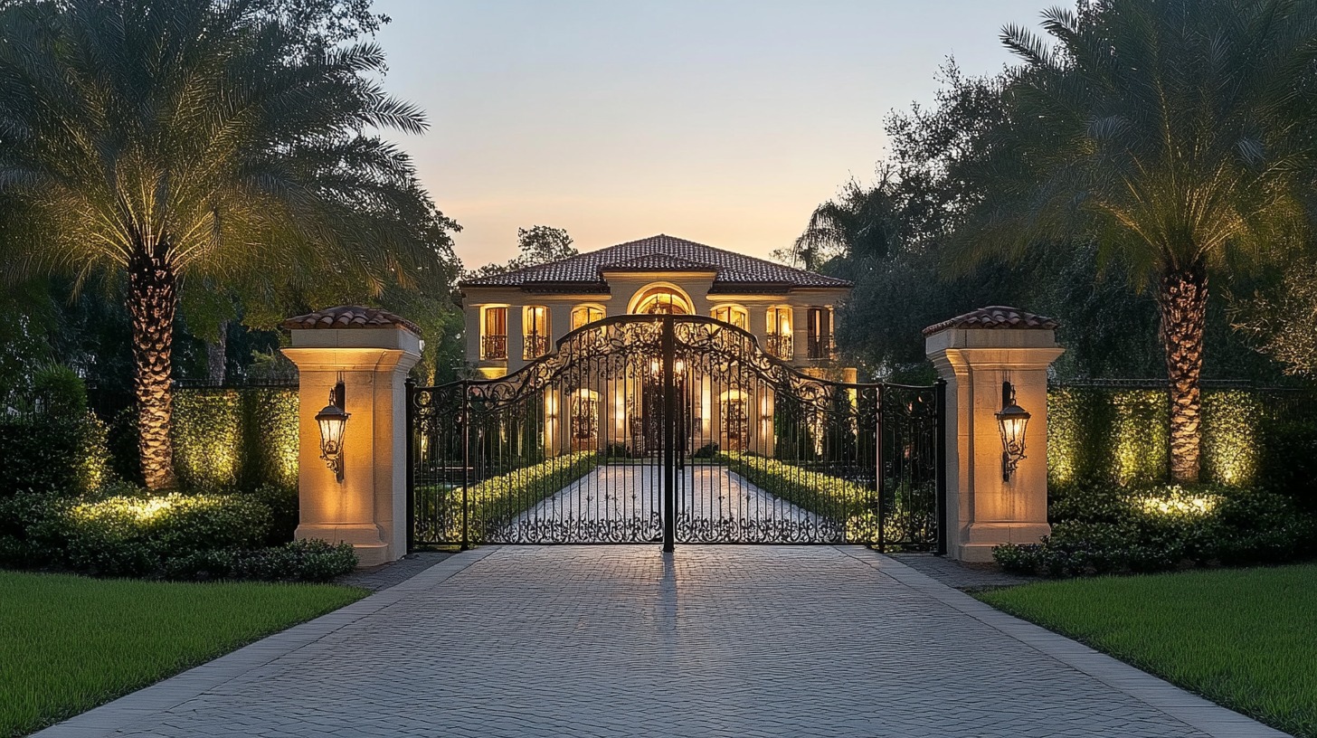
The curbside appeal has never been easier with exterior house colours and eye-catching accents for front doors, shutters and furniture pieces that are key for outdoor living. You could boast hues of brown in and around your abode to help add focus to the accent features, at the same time colours like boss green, white and grey can work well to upholster the room or to paint furniture to give it a modern vibe.
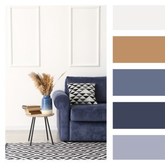
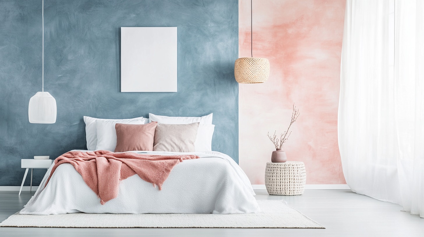
Colours for Interior Design in Bedrooms
Trust Colours
With a homely aesthetic, a pallet that draws on a nostalgic mix of comfort and security works best for painting interior design ideas for the bedroom. From sleeping to eating, and working to working out – most homes are becoming the interior hub for many busy, action-packed days. What was once a place for rest and relaxation, now embodies a living environment of family, work and play. Bedroom colour combinations have been spruced up a ton since 2018.
Earth-based hues create a harmonious setting to help with inspiration and creativity. As our home and work lives continue to blur, we should upgrade our spaces accordingly, they should be a hybrid of functionality. This offers the ultimate palette for flexible living. Draw on nostalgia, comfort and security. And make way for textures that are naturally authentic, like stained timber and feature materials that are sourced sustainably.
Subtle Focus
Light hues feel sophisticated and inviting, creating an atmosphere that is effortlessly serene. An interior colour combination for a bedroom, such as this, gives a zen vibe that all bedrooms should aspire to have. Choose colours like light blue, pastel blue, creams and mellow yellows.
Quiet Resplended Haven
Deep hues have a reassuringly sublime and dependable nature, delivering the effect of a peaceful oasis located in your home. Tones like Purples, dark blues shades of forest green, magenta and ochar work best for this trend.

Paints for the Interior Design of Bathrooms
Timeless Colours
Take a moment to reflect and reset, bare this in mind whilst planning your interior design ideas for a bathroom. Intriguing, balanced, and deeply soothing, the Benjamin Moore Colour, October Mist 1495, creates a natural harmony. These colours make your home feel even more like home. Harbouring in those cool tones to bring the ocean to you.
Casual Comfort
Light warm neutrals and whites create an inviting feeling into your personal space in your bathroom. This gives that ideal relaxed comfy feel which is perfect for a bathroom colour combination.
Calm Zone
Soothing blues and greens create a restorative escape offering ease and solace. These shades are highlights for this year's colours that pop off the shelves and are making a splash across bathrooms everywhere.

Interior Design Ideas for the Kid's Room
Earth Colours
Colours from all over the world are represented in this colour palette, ideal for the interiors of a kid's room. From the golden pink shades of the Moroccan deserts to the burnt orange shades with Mexico. The earth's own colours create associations with landscapes and cultures around the world. Clay and rock, sand and soil, these colours are soothing and rich, beautiful and different. Red and brown, muted yellow and rustic terracotta. These are earth tones that have a unifying effect. This can also lend a tranquil look that is ideal for a kid's room.
The warm colour palette takes its inspiration from different cultures around the world and invites you to create a warm and inspiring interior. This is a palette for creative minds, adventurous souls sand lovers of true craftsmanship.
Soft Neutral Colours
The combination of neutral colour tones can have a major impact on the atmosphere in a room. These colours do not demand attention but envelop us in their brightness and soft, soothing appearance.
Minimalist rooms don't have to feel cold or empty. This palette of warm and timeless hues strikes a perfect balance between understated beauty. The shades can be used to create a monochrome style or combined with more colourful colours for exciting contrasts.
Dreamy Pastels Hues
The colours in this family are both retrospective and forward-looking, bringing an element of Scandinavian vintage into an otherwise modern interior. Sophisticated and attractive. These shades create a nostalgic and contemporary style and open up to playful combinations in beautiful interiors.
Airy Tones
In an everyday life with constant distraction, beautiful botanicals, greens and greys can create an experience of timelessness and tranquillity. This is a palette for those of us who want to be more present in the now and seize the moment. With these colours, you create a cosy and harmonious environment. They encourage you to make your home an inviting place to recharge your batteries. From spectacular, beautiful fjords to rugged simplicity. The colours in this palette are inspired by the contrasts of nature and provide a new filling of fresh joy for all senses.

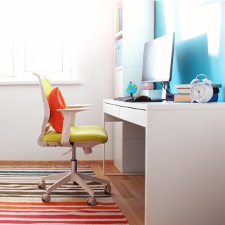
Reset Vibes Paints for Interior Design Ideas for the Study Room
Reset Vibes
With uplifting colours and a bold sense of renewal, you shall welcome the new normal with open arms. It’s time to renew yourself, by embracing unified colours and retro influences. Life may feel a little slower, but each moment is enriched by building new connections with those around us.
Stay upbeat with the stronger colours in the Reset palette. Bolder tones lift interiors to brighten your outlook. Vibrant pops of fun retro colour hint at 70s nostalgia.
Transcend
This is a mid-tone oatmeal-coloured hue that draws on earthy influences and nostalgia. The antidote to an era of cool greys, this cosy neutral emulates the feeling of a warm latte on a cool morning or warm sand on a sunny summer day.
Big Cypress
This is shaded ginger with persimmon undertones, which is the equivalent of a big, comforting hug for your home. Study room colour combinations need a warm tone and this shade gives it that, along with a modern edge.
Misty Aqua
With a watercolour cerulean blue, this shade provides an unexpected pairing of freshness against the other warm, earthy tones.
Interior Design Ideas for the Drawing Room
Nourish And Rejuvenating Vibes
Nourishing vibes encourage you to unplug and be present in the moment. Indulge in a nurturing palette that revitalizes your home and nourishes the soul.
A renewed palette of warm neutrals inspires fresh interest by adding accents of yellow and green. The Nourish pallet draws on nature and its colours that are very much needed for comfort. It looks too rounded forms, and soft objects to blend the identity between decor and furniture. With a renewed appreciation for natural beauty; complement your home with simple, textural and nurturing hues and admire your tranquil surroundings.
Evergreen Fog
Sherwin-Williams have chosen Evergreen Fog SW 9130 as their colour. According to the director of colour marketing, Sue Wadden: “The home is now the ultimate retreat from the world, and the colour is an easy and effective way to create a personal haven,” Evergreen Fog SW 9130 is a dark, sophisticated grey, the colour inspires all of us to find sanctuary in any space. Evergreen Fog SW 9130 is a rich anchor that grounds the mind is calm, and stable with its ties to the natural world.
The colour is warm and relaxing and also neutral enough to use as a base and combine with other colour tones.
You could always go with blues and reds, greens and yellows, contrast or a white whale wall, whatever it is that you want, but remember to make sure it has a splash of you in it. Nothing says first impressions like walking into a home that exudes YOU! And we’re here to help you find the best version of you, to reflect in your interiors. You can even drop us a comment below and we will reach out to you and help you with your search.
5 ways to match your interior and exterior
Matching Tiles
First and foremost, ensure your home interior colour and design and external flooring is of the same style and substance.
This, however, could be a challenge because, unlike the inside, the outdoor flooring would be exposed to dust, heat, and cold.
As a result, hardwood floors and carpets are out, but ceramic tiles, which are both durable and easy to match, might work.
Forget the Wall
As you want to connect your inner and outside spaces, you'll have to remove the barriers even if it means sacrificing the wall you so lovingly decorated.
So, what's the solution? We're not asking you to remove all barriers between your hall and the patio. Instead, use high-quality glass panels to separate the two areas. This will help you have a balanced home colour combination.
Colour Scheme
The general house painting designs and colours on both sides should be similar to that of the flooring. If you have a white sofa set in your home, then your garden set should be white as well.
Similarly, mix and match more interior design colour schemes to make your interior and outdoor colour schemes more harmonious. Also, don't go overboard with the vintage or ultra-modern looks; find a happy medium.
Right Doors
As you'll be removing the wall that divides your home's inside and exterior, choosing the right door to connect the two sides can be tricky.
Customizable bi-fold doors, on the other hand, could be a terrific option. They are long-lasting, weather-resistant and produce less noise.
Lighting
Last but not least, it's critical to coordinate your home's interior and external lighting. So, how can you strike that sweet spot?
One practical solution is to move the external light source away from the facade and move the internal light source closer to the outside wall. Your interior and external lights will look great together in this manner.
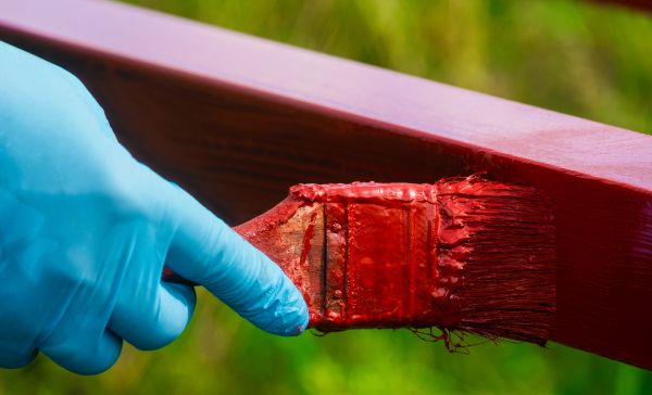
Best Paint for Interior Walls
NoBroker Painting services, we can help to pick the right colour combinations for your home, we provide clean-up services after the job and also provide the best-in-class service! Click the link below to know more and get great DISCOUNTS.
FAQ's
Ans. It is advisable to not use colour combinations that don’t complement each other. Some are, green and red, green and brown, light green and yellow, light green and red, green and black, etc.
Ans. Bright yellow. Pure bright yellow is a colour that should be avoided because if there is a lot of light coming into your room, there is even more light reflected, hence causing stress to your eyes.
Ans. Some good colours that work great with bedrooms or living rooms are, cream white and coral shades, earl white and tones of blue.
Ans. A lot of people go in for brighter or cooling colours for bedrooms, as it brings a sense of calm and clean to the aesthetic or vibe. Some colours that are great for this are lavender and white, or indigo and white, shades of peach, coral or even bearable pinks.
Ans. A lot of the colours that people are digging this year include, blush pink, icy blue tones, corals, caramels, different shades of lilac, and khaki green is making quite a splash in the colour world this year.
Ans. It’s important to remember that bright colours and lighter tones make a room feel more spacious and bigger, so opt for off whites, shades of blue, lavender and lilac. you can always experiment with different colours and see what you like.
Recommended Reading
Enamel Paint for Walls: Easy Application for a Lasting Impression
January 31, 2025
7487+ views
Interior Colour Combinations for Homes in 2026
January 31, 2025
7371+ views
Loved what you read? Share it with others!
NoBroker Painting Tips & Color Ideas Testimonials
Before this festive season
get your house painted
Most Viewed Articles
40+ Best Stunning Two Colour Combinations for Bedroom Walls to Elevate Your Space in 2026
January 31, 2025
335572+ views
Top 25 Outside Color Combinations with Colour Codes for Indian Homes in 2026
May 16, 2025
309388+ views
Asian Paint Price 20 Litre for Different Variants in India: Coverage, Durability and Benefits
May 17, 2025
174237+ views
25 Latest Main Gate Colour Combination Ideas: Direction and Placement as Per Vastu in 2026
October 9, 2025
154748+ views
Top 26 Wall Paint Colour Combinations Ideas With Codes for Every Room in 2026
February 3, 2025
135934+ views
 Author
Recent blogs in
Best Colour for Home Exterior Based on Climate, Style and Modern Design with Colour Codes in 2026
February 19, 2026 by Priyanka Saha
Radium Paint for Walls: Types, Application and Protective Features in 2026
February 19, 2026 by Priyanka Saha
10 Best Brick Wall Painting Texture Design for Modern and Rustic Homes in 2026
February 19, 2026 by Krishnanunni H M


 Full RM + FRM support


Join the conversation!