Table of Contents
Quality Service Guarantee Or Painting Free

Get a rental agreement with doorstep delivery

Find the BEST deals and get unbelievable DISCOUNTS directly from builders!

5-Star rated painters, premium paints and services at the BEST PRICES!
Loved what you read? Share it with others!
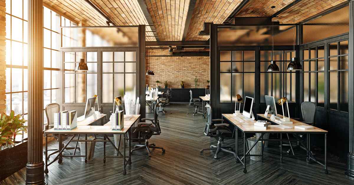
Boost Productivity with Inspiring Office Colour Combinations
Table of Contents
Many of you might be wondering what the best office colour combination is? What kind of interiors will make an impression on your customers and inspire your employees? There is no right or wrong answer to this question. The only plausible explanation- it all depends on the brand image you want to establish for your customers. Also, due to the pandemic situation, as more and more people are forced to work from home, a well-designed home office is needed more than ever before. Of course, you can take inspiration from all sorts of office colour combinations for commercial spaces as well as for your home office from the internet. But having too many options might be overwhelming. That is why we have curated a list of the trendiest colour options for you to choose from.
Office Colour Combination
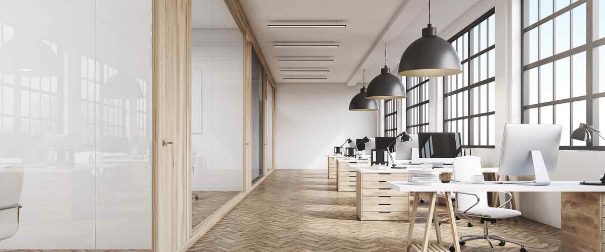
If you want to redo your office interior design, adding in fresh coats of paint is a budget-friendly option. Now you might be confused as to why the colour matters so much. Let us tell you that colour psychology is a thing! Consciously or unconsciously, your office interior colour combinations dramatically impact the mood and morale of the employees as well as help create a lasting impression on your customer's minds. Refer to the table below for the office colour ideas based on the space:
| Area | Best Colour Combinations |
| Reception Area | Neutral tones (e.g., beige, grey) with pops of vibrant accent colours (e.g., teal, orange) |
| Conference Room | Classic and sophisticated colours (e.g., navy blue, deep gray) with a touch of warm tones (e.g., burgundy, gold) |
| Private Offices | Subtle and calming colours (e.g., light blue, pale green) for a peaceful and focused atmosphere |
| Collaborative Spaces | Energising and vibrant colours (e.g., yellow, bright green) to stimulate creativity and engagement |
| Break Room | Warm and inviting colours (e.g., warm brown, soft orange) for a relaxed and comfortable environment |
| Workstations | Neutral and versatile colours (e.g., white, light grey) to promote concentration and adaptability |
| Hallways | Light and airy colours (e.g., off-white, light beige) for a spacious and open feel |
| Wellness Room | Soothing and calming colours (e.g., lavender, light pink) to create a serene and tranquil space |
| Executive Suite | Elegant and sophisticated colours (e.g., charcoal grey, deep purple) for a luxurious and professional atmosphere |
| Multi-purpose Area | Dynamic and versatile colours (e.g., bold red, bright blue) to accommodate various activities and moods |
Of course, there is no one size fits all formula when it comes to the best colour combinations for office walls. It will depend on several factors like what business you are in, how much space you have, what your company motto is, and your brand image. Of course, it's always a good idea to stick to brand colours. Also, when it comes to best colour for office walls, don't stick to wall colours. You can also experiment with textures, silhouettes, and the style and shade of your essential office furniture like tables, workstations, or employee lockers. However, for office room colour combinations at home, you get a lot more creative freedom and can personalise your working space to your liking. Based on the personality type, you can select the following workstation colour schemes
Quality Service Guarantee Or Painting Free

Get a rental agreement with doorstep delivery

Find the BEST deals and get unbelievable DISCOUNTS directly from builders!

5-Star rated painters, premium paints and services at the BEST PRICES!
| Employee Personality | Recommended Colour Combination |
| Energetic and Creative | Blue and Yellow |
| Calm and Focused | Green and White |
| Bold and Ambitious | Red and Black |
| Friendly and Collaborative | Orange and Gray |
| Sophisticated and Professional | Navy Blue and White |
| Balanced and Harmonious | Purple and Beige |
| Optimistic and Positive | Yellow and White |
| Minimalist and Modern | Gray and White |
| Serene and Tranquil | Light Blue and Cream |
| Warm and Inviting | Brown and Orange |
Best Office Wall Colour Combination to Increase Productivity
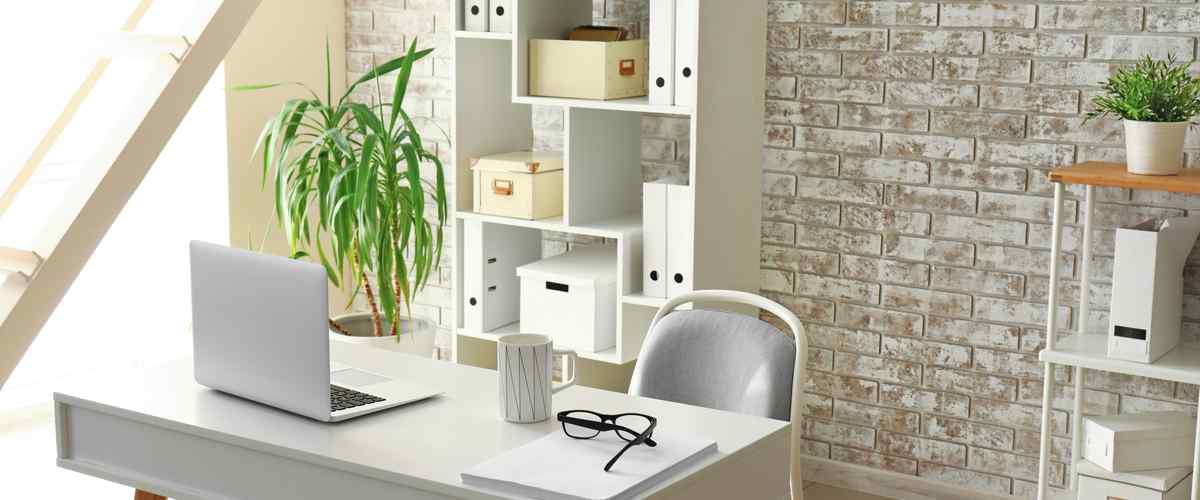
Every office environment is different. So are the people working in it. Each office, with its working dynamics, gives off very different energies. Your office interior colour combination ideas should be able to reflect that in some sense. You can start with these primary base colours for inspiration.
1. Inspiring Blues: Dive into a World of Creativity and Focus with Refreshing Blue Hues
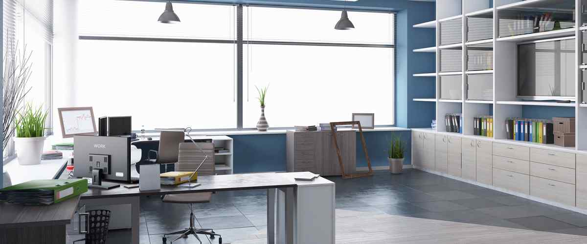
While blues can lend a calming atmosphere to any space, they can also help clarify your mind and increase your focus. So, if you wish to show off your brand's strength and resilience without coming off as condescending, then navy blues and ocean blues are great choices. Brighter hues of blue are believed to elevate everybody's energy levels by several notches.
2. Calming Greens: Embrace Tranquility and Serenity in Your Workspace with Soothing Green Shades
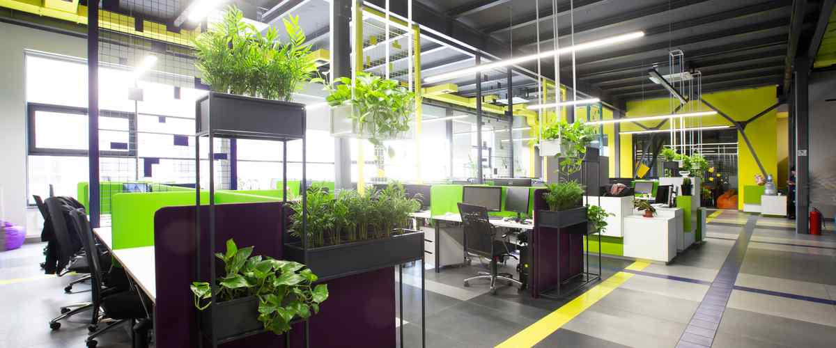
A pop of neon green will add that extra edge to your workspace, just like in the picture above. The neon green and yellow pops aptly break the monotony of the charcoal grey interiors. The plants help in making this place come alive further.
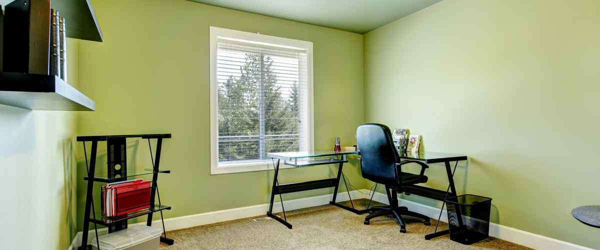
But hey, if you are not a fan of the neons or even if you overdo it, it can be jarring for your visitors. You can keep it safe and elegant by choosing more muted greens like the one above.
3. Evergreen Neutrals: Timeless Elegance Meets Versatility in the Harmonious Blend of Neutrals
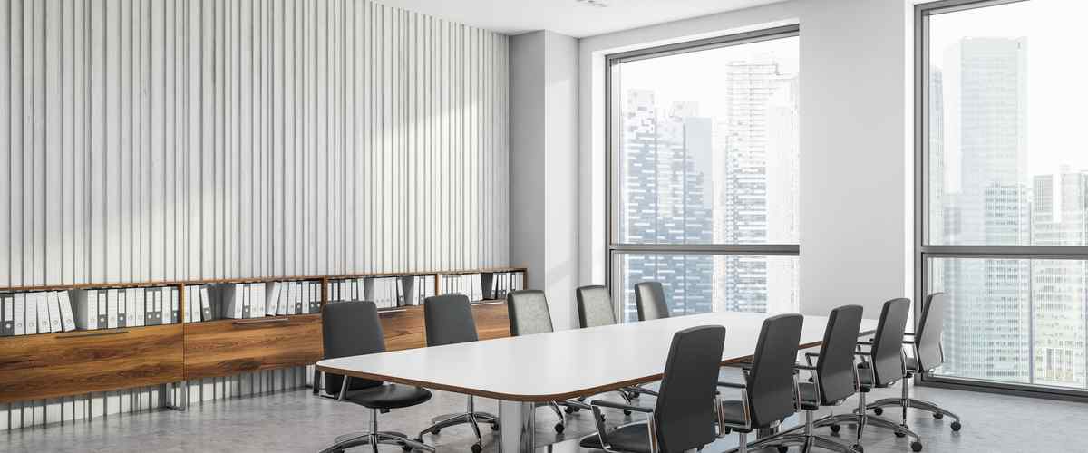
There are so many situations in the office where you need to regroup to discuss future strategies, employee performances and many other things. So naturally, such a place should be painted in basic neutrals to avoid flash. You can always add some character to your board room look by playing with wall textures in neutral shades. For reference, take a look at the picture above.
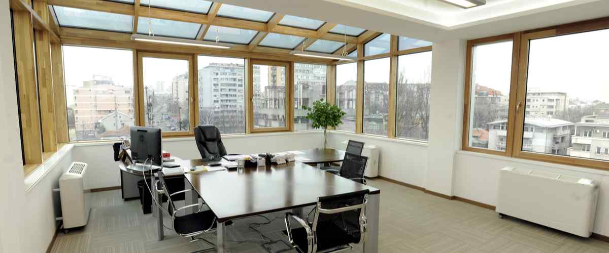
If you are not a fan of the monochrome look, choose some bright neutrals or play mix n match with the other interior design elements in your office to create a balanced look. The slanted glass roof, the beige flooring, the jet-black table-chairs, and the wooden window beans tactically make a break in this otherwise drab, white space. In addition, you can install a few potted plants to elevate this look.
4. Artistic Pink: Infuse Your Office with a Touch of Playfulness and Creativity through Artistic Pink Tones

Light pink is an excellent choice for your office interiors if you are a therapist or a doctor. Pale pink represents tenderness and sensitivity, and that's precisely what doctors and therapists do- they heal you.
5. Bold Pinks: Energize Your Workspace with Daring and Vibrant Pink Shades that Spark Inspiration
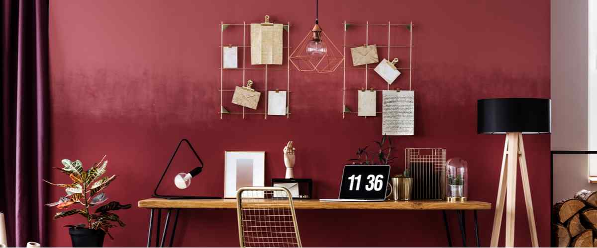
Writers and designers, listen up this one is for you! A brighter shade of pink looks artistic and creates a unique space where you can brainstorm all your ideas for the future! Moreover, bright pink represents love; hence it is a good colour for marriage bureau offices and businesses in the gifting business.
6. Sombre and Rich Browns: Set a Warm and Inviting Tone with Luxurious and Earthy Brown Tones
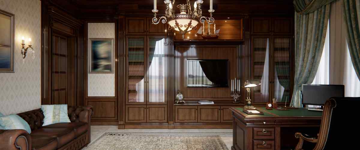
Solid wooden walls and office furniture immediately remind one of the yesteryears. If you like traditional office spaces covered with wooden antiquities, then this one's for you! The white patterned accent wall and the statement chandelier further add to the elegance of this Victorian board room.
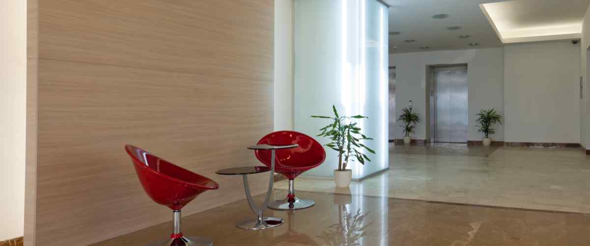
One of the most versatile colours, Browns, can suit a variety of office aesthetics if paired with the correct design elements. Browns bring warmth and familiarity to any office space. Modern office colour combinations show that the boredom of browns can be easily counteracted by furniture in bold colours, as seen here.
7. Subtle Greys: Discover the Beauty of Subtlety with Calming and Versatile Shades of Grey
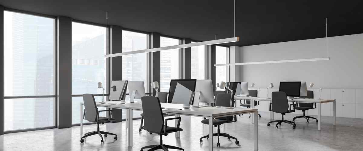
Greys are understated and elegant, yet they evoke sophistication whenever used at home or in commercial office spaces. To make it more interesting, you can play around with the textures in the same tone or use different shades of grey for other office parts. Also, using some bold coloured furniture, you can break any monochrome grey office space.
8. Cheery Yellows: Radiate Positivity and Boost Your Mood with Lively and Cheery Yellow Accents
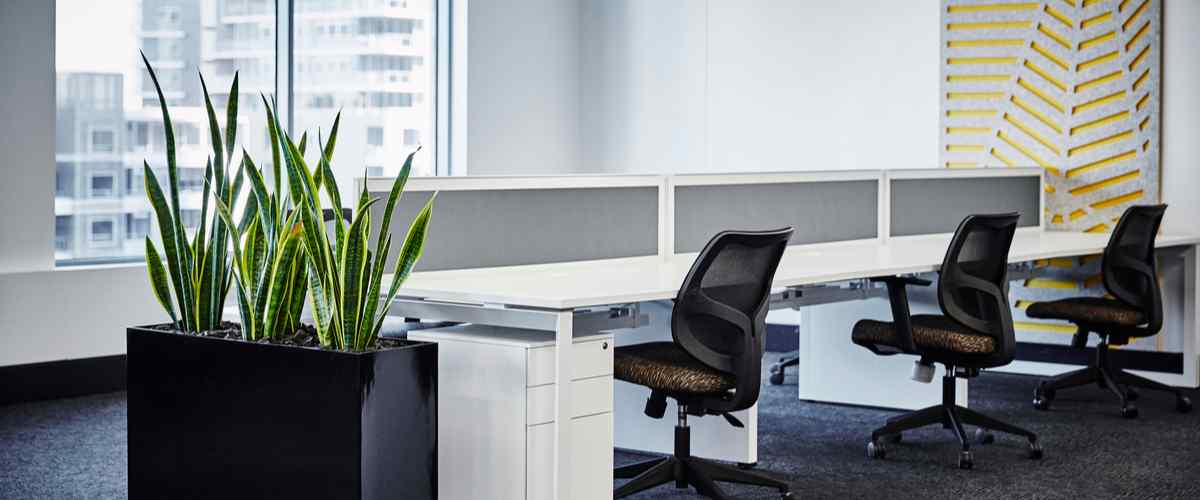
Yellow is a colour that brings positivity and happiness to any space. Of course, we are not talking about painting the whole wall in yellow. But little yellow pops here and there give a simple yet fun touch to your workspace.
9. Clean Whites: Embrace Simplicity and Sophistication with Clean and Crisp White Tones in Your Office
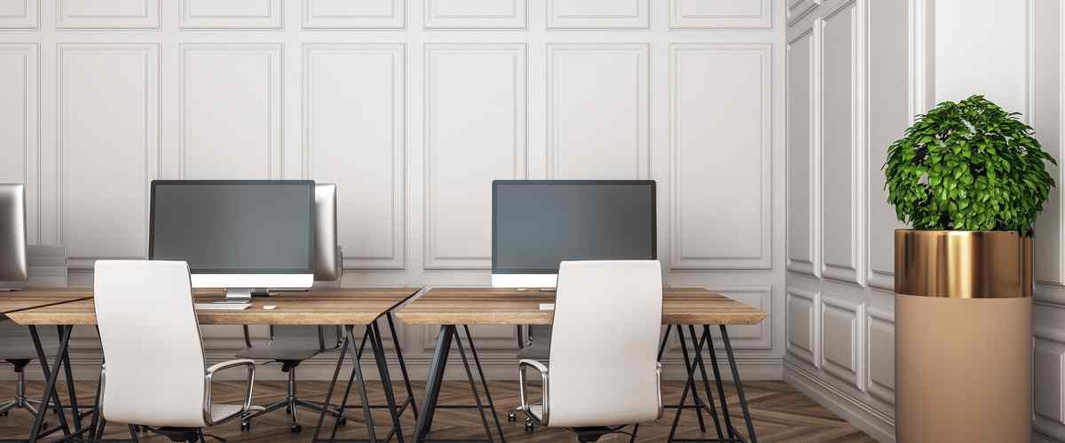
White is still one of the most popular choices for office space simply because of its versatility. The neutral space acts as a perfect background to add office furniture and design elements that fit the vibe and aesthetic of your brand. Experiment with geometric patterned walls in various shades of white to elevate your office look.
10. Powerful Black: Add a Touch of Drama and Timeless Elegance with the Strength of Powerful Black
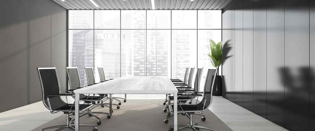
Would you love some classic vibes in your office space? Then black is one of the best office interior design colour ideas. Grounded and assertive, black also gives a clutter-free look to your office space.
11. Stylish Purples: Unleash Your Creative Spirit and Embrace Luxury with Stylish and Regal Purple Shades
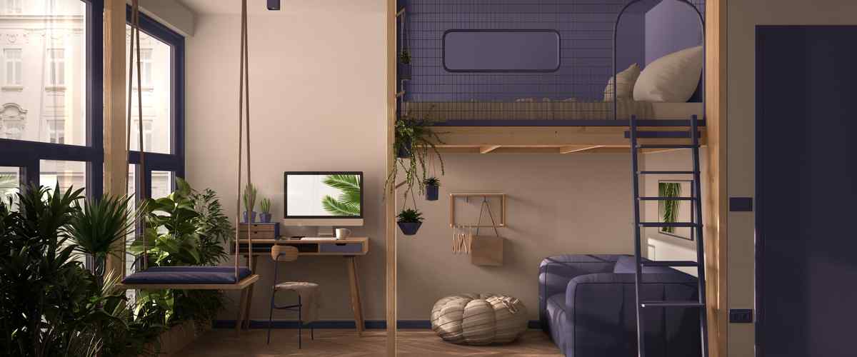
You may or may not like purple, but you can't deny the regal aura this colour possesses. In addition, the vivid purplish tones have a calming effect on the employees in very high-energy work areas, which helps them focus on productivity. You can also experiment by mixing and matching with different purple shades in the office cabin design.
12. Zesty Oranges: Ignite Energy and Enthusiasm in Your Office Space with Invigorating and Zesty Orange Hues
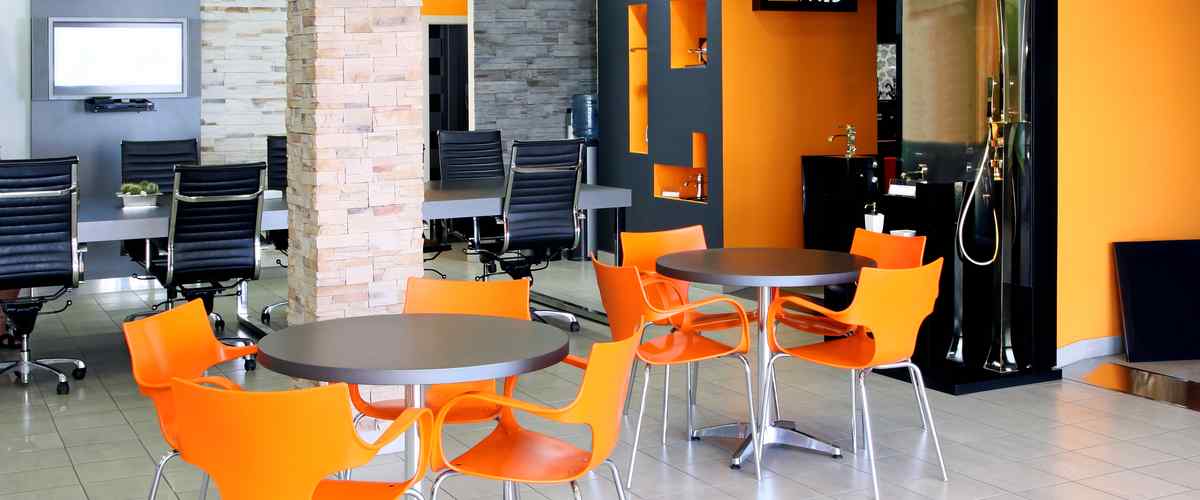
You can experiment with various shades of orange ranging from terracotta to more retro-inspired oranges. After yellows, oranges are another colour that infuses your workspace with brightness and positivity. Experts recommend orange as an ideal choice for office cafeterias.
13. Muted Reds: Create a Sense of Warmth and Comfort with Subtle and Refined Red Tones in Your Workspace
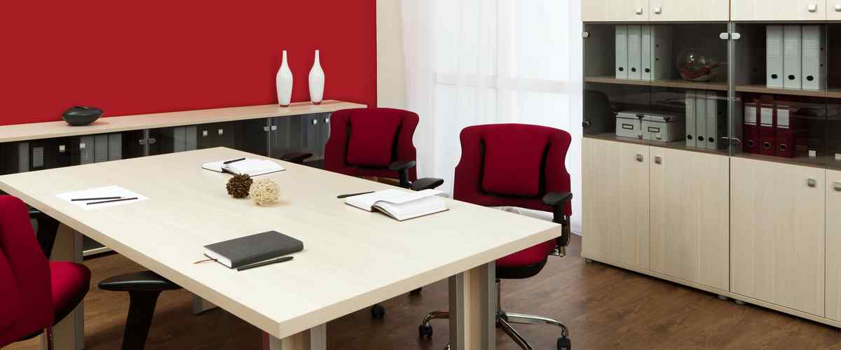
Red signifies passion and excitement, and yes, it's the colour of romance also! Another very ideal colour for gifting companies and marriage bureau offices. However, red has a lot of possibilities. A bit of a red in an otherwise neutral-toned boardroom can fire up the staff's passion and bring in a more dynamic work environment.
Now, let's move on to two colour combinations for office walls that can fit a wide range of aesthetics.
14. Greys and Whites: Achieve a Perfect Balance of Serenity and Sophistication with a Chic Blend of Greys and Whites
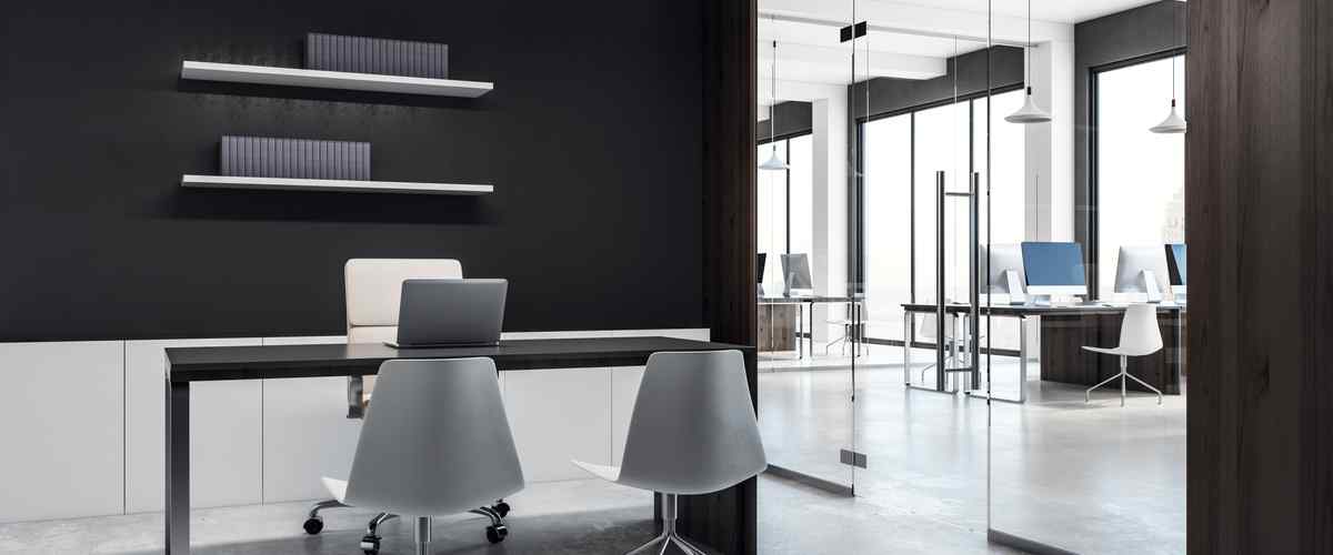
Nothing beats the understated elegance of grey-white combination walls in an office space. Take it up a notch by experimenting with wall textures and patterns in greys and whites.
15. Blues and Whites: Dive into a Refreshing and Airy Ambiance by Combining Calming Blues with Crisp Whites
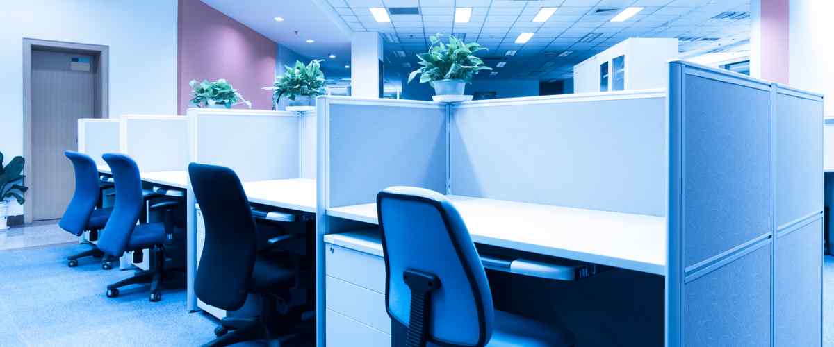
Another trendy choice for office spaces, especially BPOs, a mixture of blue and whites signifies being calm and focused on your work simultaneously. It helps foster a result-oriented office environment.
16. Yellows and Whites: Infuse Your Workspace with Radiance and Optimism by Pairing Sunny Yellows with Clean Whites
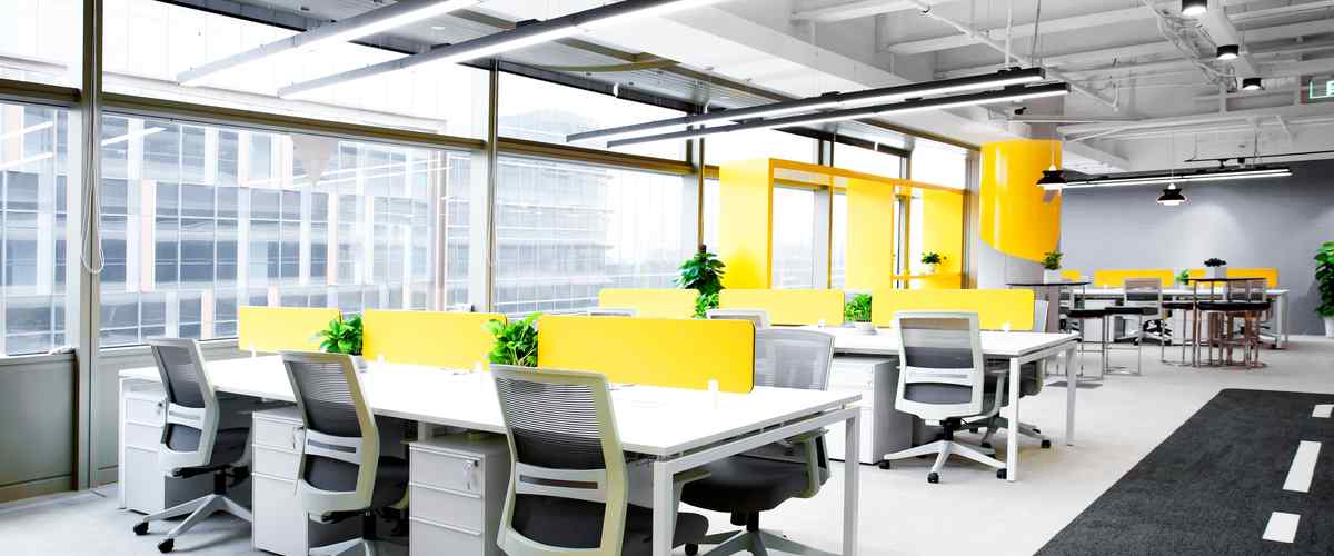
These two colours can be merged to create a cheerful yet balanced workspace. Moreover, it helps put forth the image of a result-oriented workplace that also values creative inputs from employees.
Colour Combination for Office Interior
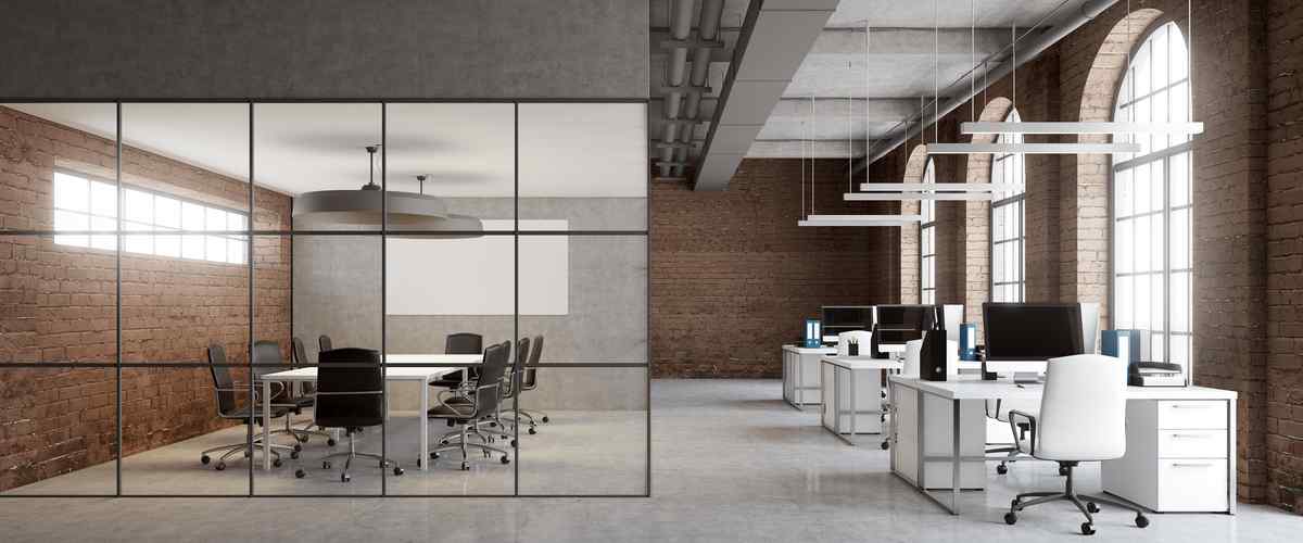
There are so many wall colour ideas to choose from. Beautifying a functional space is much a challenge as it is satisfying. You have to strike the right balance between practical and chic. Of course, you can go on with the traditional black-white or grey-white combinations. But if you are thinking of creating an inspiring workplace that fuels creativity, then it's time to add in some greens, oranges or a fiery red. They provide the perfect pop of colour that any neutral-toned office needs to look better.
Office Furniture Colour Combination
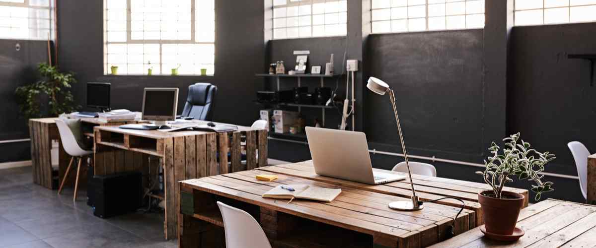
Wood is an expensive yet durable material when it comes to office furniture. Play around with the design to get the maximum out of wooden furniture. For cabinets and shelves, wood is a good choice. Plywood works too. White or beige are also good options. They brighten up the workspace. Black furniture works well against deep navy or muted green walls.
But you can also include painted white or beige work tables for a brighter environment. Of course, black is also another perfect option.
Office Table Colour Combination
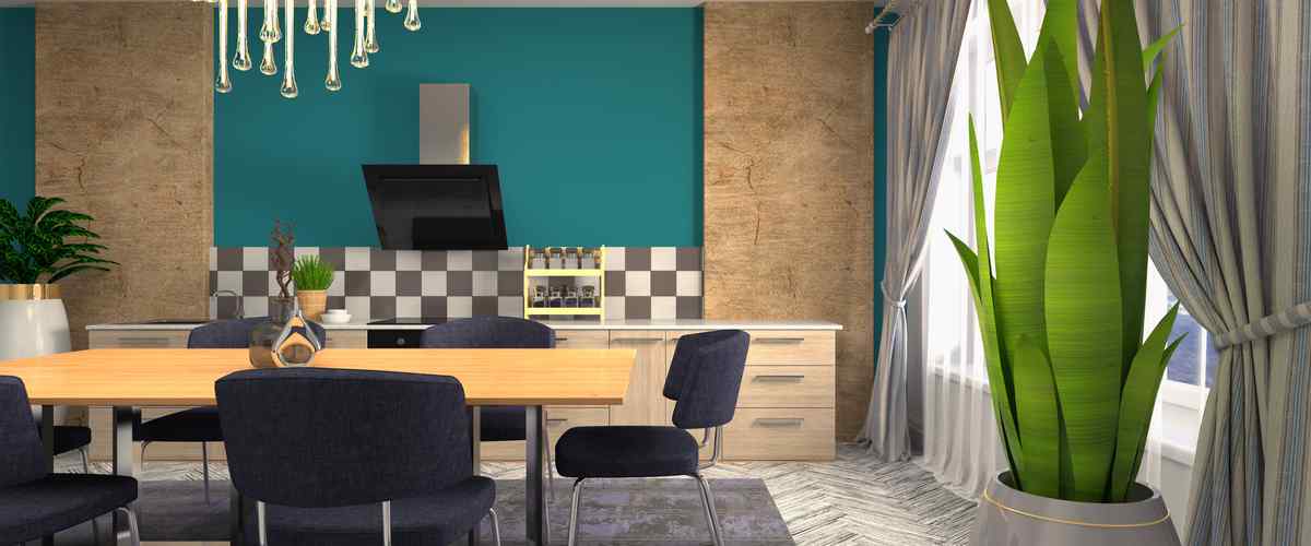
Nothing beats the elegance of a wooden work desk. But they can be expensive too. Plywood work tables are a cheaper option. But you can also include painted white or beige work tables for a brighter environment. Black is also another excellent option for office table colour combinations against deep navy walls.
Factors to Consider Before Painting Your Office
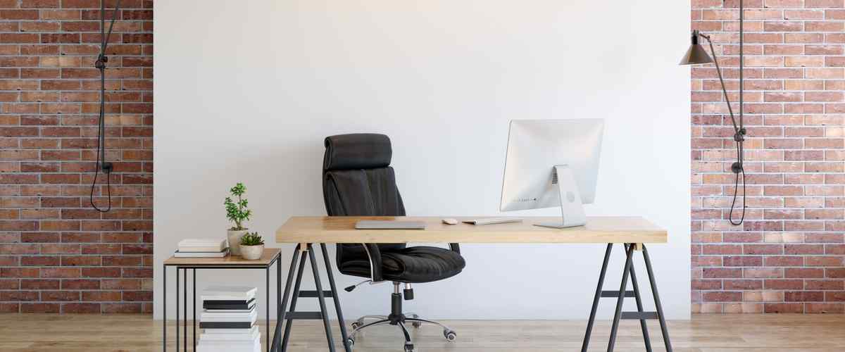
Here are some things to keep in mind while choosing appropriate colour combinations for the office room:
- Think about how you want your customers to perceive your business. Do you want your customers to feel positive and warm, or are you looking to create a long-lasting impression?
- Ask yourself if your staff will feel positive and welcomed when they come to the office every day? If you don't want your team to feel dull and uninterested in office space, make sure to incorporate some bright colours.
- Never lose sight of the fact that the primary purpose of your office is to do business. Vibrant office environments are great for advertising and marketing agencies but not for a shipping company, for example.
- The exterior paint of the office is equally important. You want your customer to feel welcomed even before they set foot inside your office premises.
- Pay attention to the finish you would want to use. Glossy and matte paints in the same shade will produce very different vibes in your office space.
Tips to Choose Office Colour Scheme
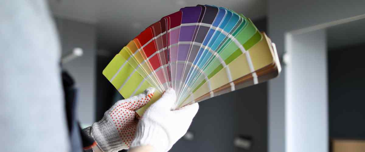
When looking for the best office paint colour combinations, consider the overall brand image. Display what you want your customers to feel about your business. Here are some pointers:
- Consider what business you are in. For example, a lawyer's office might look good with textured neutral walls paired with wooden furniture. On the other hand, an advertising agency might do well with a few pops of colour here and there.
- If you want an artistic space, choose darker colours like navy blue and pinks. For a more serious work environment, neutrals, greys and whites are good options to choose from.
- If using darker colours for the walls, make sure to have lots of large windows or bright lighting to bring out the beauty of those shades. Small office wall colour combinations might do well with lighter colours like beiges and whites, which instantly brightens up the office area in addition to lending an illusion of space.
There are many office colour combinations, from traditional neutrals to the fierier reds and oranges. Always keep in mind your company's brand image. A long-lasting impression goes a long way in ensuring customer satisfaction. For more interior design tips for your office, visit our blog section. Are you looking for some promising home office colour combination as per Vastu? Contact NoBroker internal design experts who can guide you through this process. Give us a call right away!
Frequently Asked Questions
Ans- Wooden tables are indeed a great asset to any office look. However, contemporary offices need modern solutions. Hence a textured wooden table or a plywood work desk works better.
Ans- Office cafeterias and gaming zones are the best places to use glossy paints that reflect the room's vibe.
Ans- Greys, neutrals and whites are safe choices for office interiors. On the other hand, blues and greens bring serenity and focus to your workspace. You can also use fiery reds or oranges for a bit of pop of colour.
Ans- Sure. But make sure to use the colour sparingly to avoid making your conference room look like an entertainment zone.
Ans- Install some plants or some wooden furniture, play around with textures on white walls, and you will see your drab white office room come to life gradually.
Painting Service in Top Cities in India
Recommended Reading
Cost of Painting a House Per Square Foot in India: Paint Type, Material Cost and Labour Cost
May 17, 2025
61433+ views

Best Paint for Exterior Walls in India: Strength, Finish & Climate Resistance in 2025
May 16, 2025
52008+ views
Top 20 Trending Window Colour Combinations With Codes for Stylish Homes
January 31, 2025
35877+ views
25 Best Study Room Colour Combinations for Focus: Top Ideas with Colour Codes
December 9, 2025
29619+ views
Top 25 Stunning Pink Two Colour Combinations for Bedroom Walls to Refresh Your Space in 2025
January 31, 2025
27696+ views
Loved what you read? Share it with others!
NoBroker Painting Tips & Color Ideas Testimonials
Their team is extremely professional and efficient, a pleasure to work with
Before this festive season
get your house painted
Most Viewed Articles
40+ Best Stunning Two Colour Combinations for Bedroom Walls to Elevate Your Space in 2025
January 31, 2025
334143+ views

Top 25 Outside Color Combinations with Colour Codes for a Stylish Home in 2025
May 16, 2025
294109+ views
Asian Paint Price 20 Litre for Different Variants in India: Coverage, Durability and Benefits
May 17, 2025
165100+ views
25 Latest Main Gate Colour Combination Ideas: Direction and Placement as Per Vastu in 2025
October 9, 2025
143980+ views
Top 26 Wall Paint Colour Combinations for Every Room: Bedroom, Living Room, and More
February 3, 2025
130214+ views
Recent blogs in
Top 18 Wallpaper Ideas for Small Spaces to Make Rooms Look Bigger in 2026
January 14, 2026 by Krishnanunni H M
Water-Based Paint vs Oil-Based Paint: Differences, Uses & Cost Comparison in 2026
January 9, 2026 by Krishnanunni H M
How Much Paint Is Required to Paint a Room: Easy Calculation Based on Size and Coats
January 9, 2026 by Kruthi





 Full RM + FRM support

Join the conversation!