Table of Contents
Quality Service Guarantee Or Painting Free

Get a rental agreement with doorstep delivery

Find the BEST deals and get unbelievable DISCOUNTS directly from builders!
5-Star rated painters, premium paints and services at the BEST PRICES!
Loved what you read? Share it with others!
Porch Colour Combinations for Home
Published : January 31, 2025, 12:00 AM
Updated : January 31, 2025, 12:00 AM
Author :
![]() admin
admin
Table of Contents
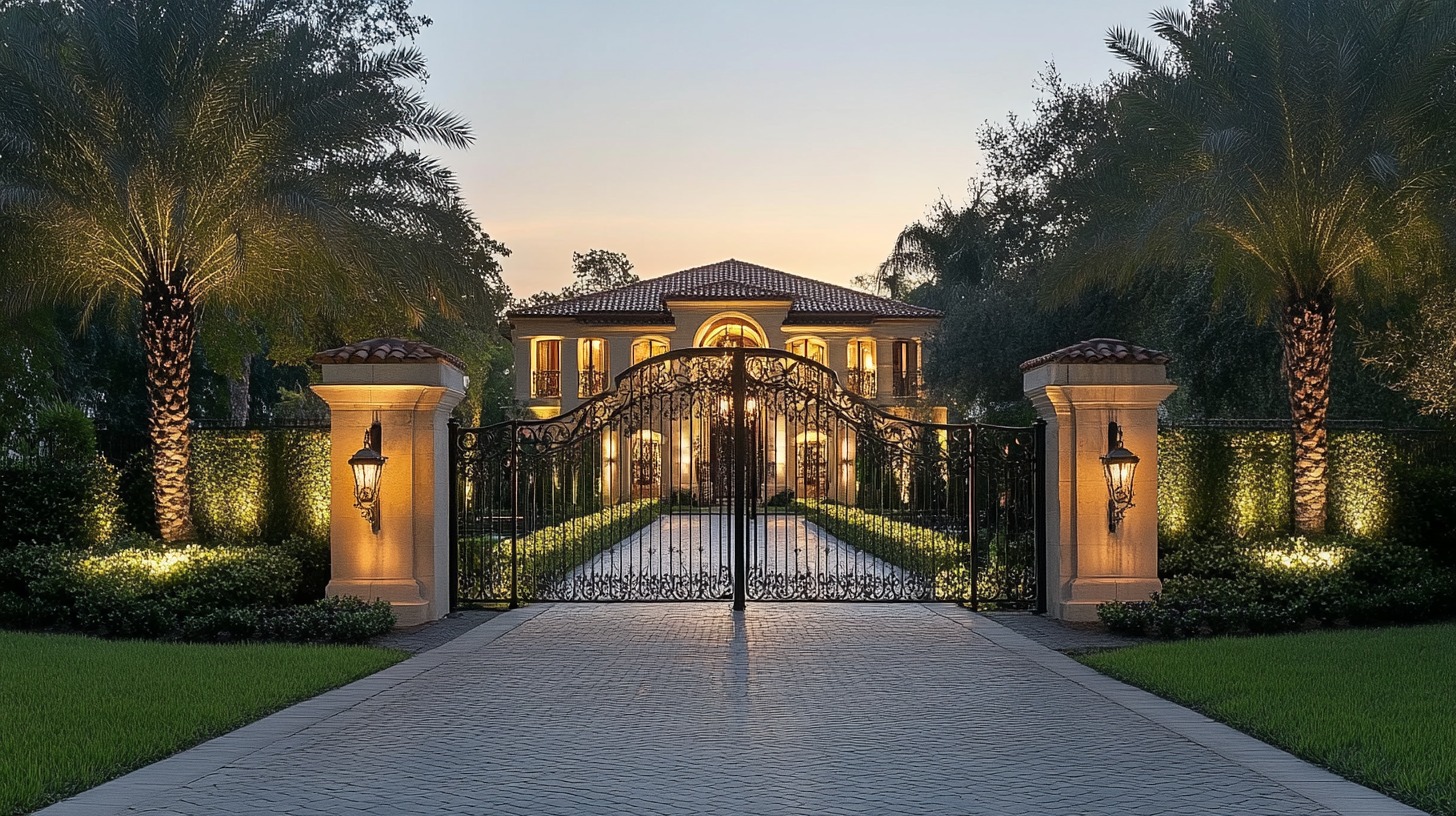
Your porch is more than just a pathway to your home; it's the first impression. Choosing the right colour combination can set the tone for the rest of your house and warmly welcome your guests. From calming pastels to bold hues, the right palette can make your doorstep a true statement.
Let’s explore porch colour combinations that not only stand out but also resonate with your home's character.
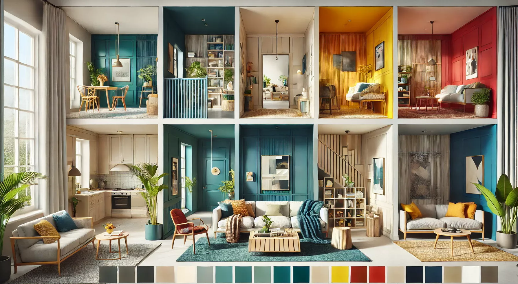
20 Porch Colour Combinations: Amplify Your Entryway with Alluring Shades
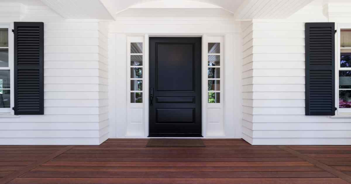
1. Classic White & Navy Blue
A timeless duo that screams elegance. The navy provides depth, while white keeps things fresh and clean, perfect for a nautical or coastal vibe.
Quality Service Guarantee Or Painting Free
Get a rental agreement with doorstep delivery
Find the BEST deals and get unbelievable DISCOUNTS directly from builders!
5-Star rated painters, premium paints and services at the BEST PRICES!
2. Warm Terra Cotta & Beige
This combo evokes a rustic, earthy feel, reminiscent of Mediterranean landscapes. The warmth of terra cotta pairs beautifully with subtle beige.
3. Forest Green & Soft Grey
Merge the feel of nature with sophistication. Forest green brings an organic touch, and grey adds a modern twist.
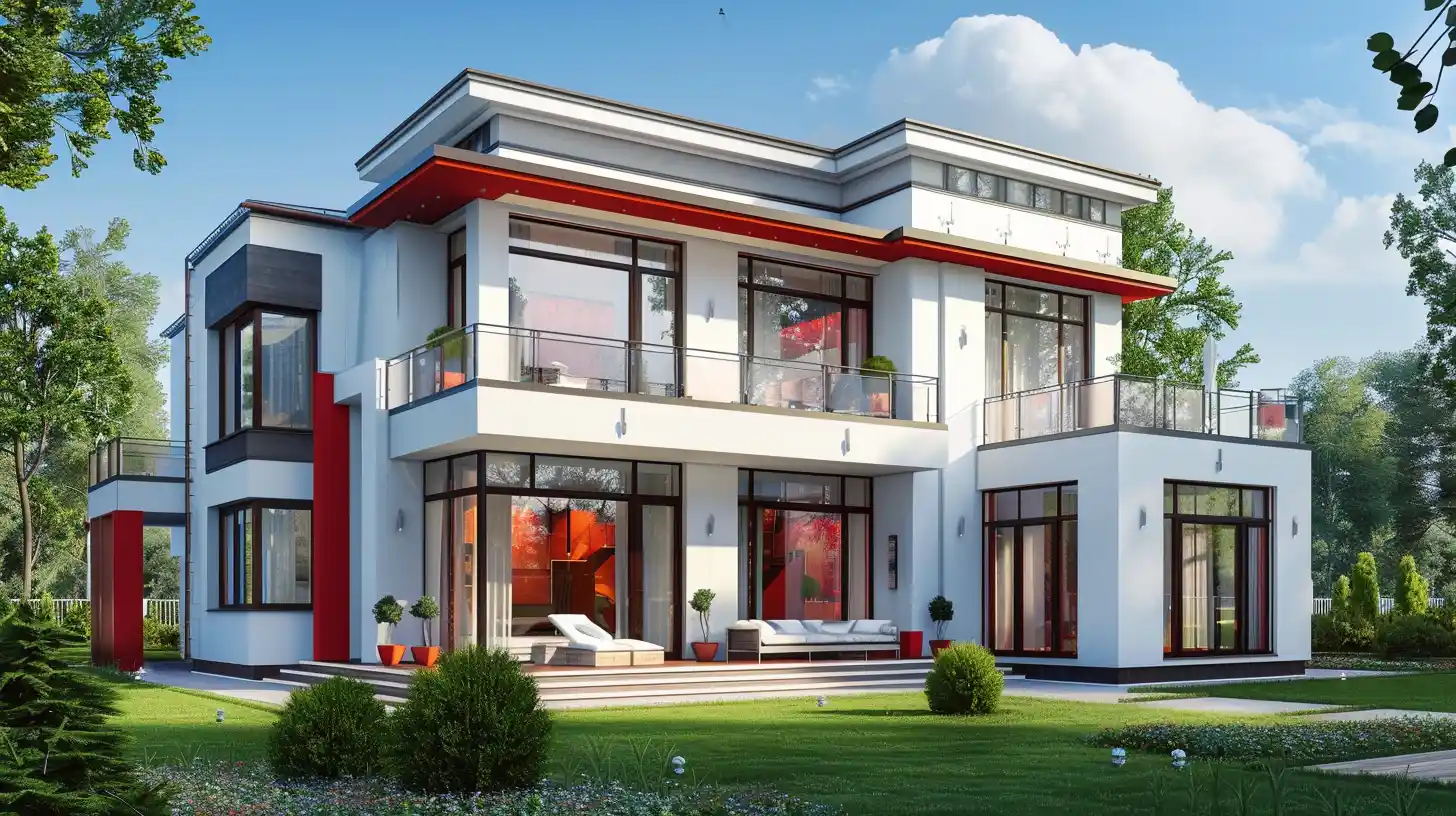
4. Burnt Orange & Charcoal
An audacious combo where the vibrant burnt orange contrasts strikingly with dark charcoal, ideal for those willing to make a bold statement.
5. Sage & Cream
Gentle and calming, sage and cream blend seamlessly to create a serene, welcoming environment for any visitor.
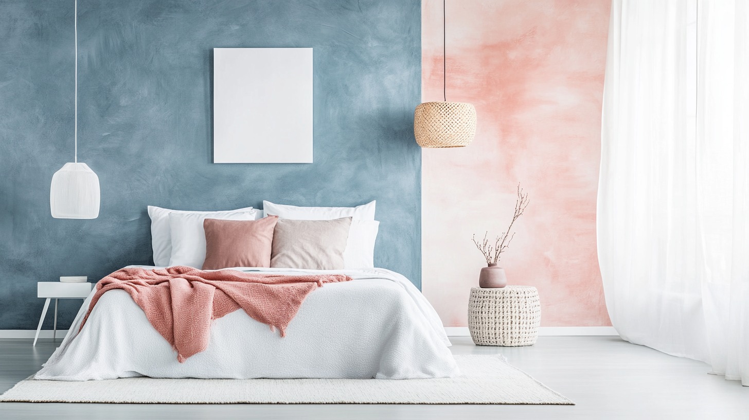
6. Lavender & Stone Grey
This pairing offers a contemporary look, with the softness of lavender complementing the neutrality of stone grey.
7. Mustard Yellow & Chocolate Brown
A zesty and grounded combo. The vivacity of mustard yellow works wonders against the deep brown, reminiscent of autumn.
8. Teal & Taupe
A delightful mix of cool and warm. Teal brings a splash of character, and taupe provides a balanced foundation.
9. Cherry Red & Slate Grey
A combination that pops! Cherry red gives life and energy, while slate grey offers a calm backdrop.
10. Buttercream & Brick Red
A vintage pair that feels homely and inviting. It’s like a countryside cottage waiting to be explored.
11. Sky Blue & Crisp White
Drawing inspiration from a cloudless summer sky, this pairing offers a breezy and pristine appearance, setting a tranquil tone for your entryway.
12. Olive Green & Sand
Capturing the serenity of a quiet forest path or a serene desert landscape, this pairing is grounded yet elegant. It's reminiscent of the raw beauty that nature effortlessly displays.
13. Plum & Soft Gold
An opulent pairing that exudes luxury. Plum's depth paired with the glint of soft gold is nothing short of regal.
14. Peach & Muted Green
Evoking the tender blossoms of spring and the freshness of new leaves, this duo breathes life and invigorates energy into any space.
15. Turquoise & Butter Yellow
The cool tranquillity of turquoise perfectly balances the sunny optimism of butter yellow, creating a space filled with joyful memories and contemporary charm.
16. Midnight Blue & Silver
A match that speaks of starry nights. Midnight blue’s depth coupled with silver highlights creates a mesmerizing effect.
17. Rose Pink & Warm Grey
The blushing undertones of rose pink are enhanced beautifully by the subtle sophistication of warm grey, weaving a tale of quiet passion and contemporary grace.
18. Goldenrod & Deep Green
Earthy with a hint of flair. Goldenrod stands out brilliantly against the rich backdrop of deep green.
19. Coral & Dove White
A summery, beachy blend. Coral offers a splash of the tropics, while dove white keeps it light and airy.
20. Cinnamon & Cool Blue
A mix of warmth and coolness. Cinnamon's spicy undertones match beautifully with the tranquil vibes of cool blue.
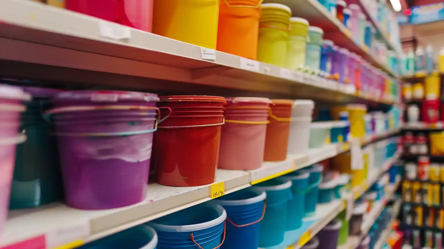
Maximizing Your Porch’s Aesthetic Appeal with NoBroker Painting Services
Choosing the perfect porch colour paint combination can set the tone for your entire home. But how can NoBroker help elevate this process? Here's how:
Prioritizing Quality and Safety: At NoBroker, we believe in only using chemicals of the highest quality that are specialized for specific tasks. Moreover, the safety of your home and environment is paramount to us, so we ensure the chemicals used are safe and environmentally friendly.
Cutting-Edge Equipment: The right tools can make all the difference. NoBroker ensures that the process is seamless and efficient by employing mechanized and professional-grade equipment, ensuring precision in every stroke and coat.
Expertise You Can Trust: Painting requires both artistic vision and technical skill. Our painters are not only experienced but also uphold the highest standards of professionalism.
Frequently Asked Questions
A. Yes, the direction can play a role. North-facing porches often get less direct sunlight and can appear cooler, so warmer tones might be preferable to balance this out. South or west-facing porches that receive a lot of sunlight might fare better with lighter or UV-resistant colours to prevent rapid fading.
A. A balanced approach is key. Choose one primary colour for large areas, such as walls or floors. Use a secondary colour for trim, railings, or accent areas. Lastly, consider a third, complementary hue for decorative elements like planters or furniture. Maintaining a 60-30-10 distribution (primary-secondary-accent) can help create a harmonious look.
A. Generally, lighter colours can make a space feel more open and airy, potentially making a small porch seem larger. Dark colours, on the other hand, can add depth and cosiness but might make a compact space feel more confined.
A. The longevity of your porch's paint job depends on factors like the quality of the paint, the local climate, and the amount of foot traffic it receives. Typically, a well-painted porch may last anywhere from 3 to 7 years before requiring a touch-up or full repaint.
A. It's best to paint in mild weather conditions when temperatures are between 50-85°F (10-30°C). Avoid painting during extreme temperatures, high humidity, or when rain is forecasted within 24 hours. These conditions can affect paint adhesion, drying time, and the final finish.
Recommended Reading
40+ Best Stunning Two Colour Combinations for Bedroom Walls to Elevate Your Space in 2025
January 31, 2025
334132+ views
Top 25 Outside Color Combinations with Colour Codes for a Stylish Home in 2025
May 16, 2025
293871+ views
25 Latest Main Gate Colour Combination Ideas: Direction and Placement as Per Vastu in 2025
October 9, 2025
143878+ views
Top 26 Wall Paint Colour Combinations for Every Room: Bedroom, Living Room, and More
February 3, 2025
130131+ views
Asian Paints Off White Colour Codes: Names, Product Range and Paint Price
January 31, 2025
89559+ views
Loved what you read? Share it with others!
NoBroker Painting Tips & Color Ideas Testimonials
Their team is extremely professional and efficient, a pleasure to work with
Before this festive season
get your house painted
Most Viewed Articles
40+ Best Stunning Two Colour Combinations for Bedroom Walls to Elevate Your Space in 2025
January 31, 2025
334132+ views
Top 25 Outside Color Combinations with Colour Codes for a Stylish Home in 2025
May 16, 2025
293871+ views
Asian Paint Price 20 Litre for Different Variants in India: Coverage, Durability and Benefits
May 17, 2025
165014+ views
25 Latest Main Gate Colour Combination Ideas: Direction and Placement as Per Vastu in 2025
October 9, 2025
143878+ views
Top 26 Wall Paint Colour Combinations for Every Room: Bedroom, Living Room, and More
February 3, 2025
130131+ views
Painting Services in Top Cities of India
Top Paint Brands in India
| Asian Paints | Nerolac Paints |
| Berger Paints | Indigo Paints |
| Dulux Paints | Nippon Paints |
| Shalimar Paints |
Recent blogs in
Top 18 Wallpaper Ideas for Small Spaces to Make Rooms Look Bigger in 2026
January 14, 2026 by Krishnanunni H M
Water-Based Paint vs Oil-Based Paint: Differences, Uses & Cost Comparison in 2026
January 9, 2026 by Krishnanunni H M
How Much Paint Is Required to Paint a Room: Easy Calculation Based on Size and Coats
January 9, 2026 by Kruthi


 Full RM + FRM support


Join the conversation!