Table of Contents
Quality Service Guarantee Or Painting Free

Get a rental agreement with doorstep delivery

Find the BEST deals and get unbelievable DISCOUNTS directly from builders!

5-Star rated painters, premium paints and services at the BEST PRICES!
Loved what you read? Share it with others!
Stunning Tri Colour Painting Ideas for Your Home Decor
Table of Contents
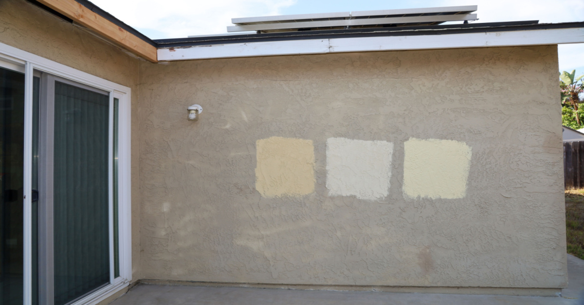
Tri colour painting is a simple yet powerful art form. It uses three colours to create a range of emotions, symbols, and artistic expressions. This type of painting can use bright primary colours or softer, more subtle shades, offering endless possibilities for artists.
But the question that arises is which tri colour paints are trending. Well, this article will have a closer look at tri colour painting. This will also discuss how you can choose the right tri colour combination. So, let’s get started!
The Magic of Three
Colour psychology studies how colours can change moods and behaviours. It shows that colours can trigger emotional reactions, which things like a person’s age or cultural background can influence them.
Quality Service Guarantee Or Painting Free

Get a rental agreement with doorstep delivery

Find the BEST deals and get unbelievable DISCOUNTS directly from builders!

5-Star rated painters, premium paints and services at the BEST PRICES!
Choosing three colours together can create different feelings and styles.
Some examples are:
- Green + Blue + Violet: This mix gives a modern and fresh look. The primary colours are blue and violet, with a touch of green. These colours can add depth to any space.
- Blue + Pink + Beige: The bright combination of pink and blue gives a modern feel balanced by the calming beige. This triple colour combination offers a lot of contrast but still looks timeless.
- Green + Grey + Pink: This mix is inspired by nature, like earthy pink, green plants, and grey. It creates a peaceful, comfortable feeling and a clean and modern look.
Each colour in a three-colour mix should work well with the other two. The right mix can create a stylish and dynamic look, whether it’s for your home, a graphic design, or a user interface. Remember, the effect of colour can change depending on different cultures and personal views. So, it’s always good to consider the context and audience when choosing colour mixes.
Top 12 Tri Colour Combinations for Your House in 2024
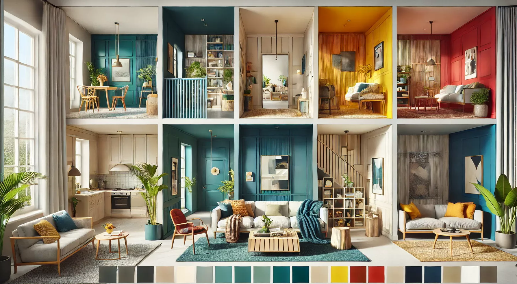
Three color house combinations can revitalise your space, contributing depth, character, and visual appeal. In 2024, trends favour balanced yet daring colour schemes that express uniqueness and inventiveness. The top 12 tri colour painting options are:
1. Light Purple, Light Green, and Light Blue
This tri colour combination is all about tranquillity and serenity. Light Purple is a soothing colour often associated with nobility and luxury. It has the calm stability of Blue and the fierce energy of red, home symbolising power, ambition, and creativity. When used in interior design, it can provide a sense of calm and relaxation.
On the other hand, light green is a colour that is restful, soothing, cheerful, and health-giving. It’s the colour of nature, symbolising growth, harmony, freshness, and fertility. In-home decor creates a refreshing and tranquil ambience.
Light Blue is a colour that seeks peace and tranquillity above everything else, promoting both physical and mental relaxation. It reduces stress, creating a sense of calmness, relaxation, and order.
When these three colours are used together, they create a harmonious, tranquil, comforting, and refreshing atmosphere. The blend of these colours can make your home feel like a peaceful retreat where you can unwind and rejuvenate.
2. Pink, Grey, and Gold
This three colour combination for bedroom walls exudes elegance and sophistication. Pink is a delicate colour that represents compassion, nurturing, and love. It’s a cheerful colour, inspiring warm and comforting feelings, a sense that everything will be okay. In interior design, pink can give rooms a fresh, youthful look.
Grey is an excellent, neutral, and balanced colour. It’s often associated with formality and sophistication. Grey rooms can be sophisticated and elegant or can give a moody feel. It’s a perfect neutral backdrop that can be paired with almost any colour.
Gold is a colour of success, achievement, and triumph. It’s associated with luxury, quality, prestige, and sophistication. It’s a warm colour that can brighten up spaces and make them look luxurious and elegant.
When combined, pink, grey, and gold create a chic and modern look. The warmth of pink and gold balances the coolness of grey, creating a balanced and harmonious look. This three colour combination for exterior walls can give your home a luxurious and sophisticated vibe.
3. Red, Yellow, and Blue
Red is a very emotionally intense colour. It enhances human metabolism, increases respiration rate, and raises blood pressure. It has high visibility. Additionally, red can bring warmth and energy to a space.
Yellow, the colour of sunshine, is associated with joy, happiness, intellect, and energy. It produces a warming effect, arouses cheerfulness, stimulates mental activity, and generates muscle energy. In-home decor, yellow can be used to bring brightness and vitality.
Blue is the colour of the sky and sea. It is often associated with depth and stability. It symbolises trust, loyalty, wisdom, confidence, intelligence, faith, truth, and heaven. Blue is considered beneficial to the mind and body. It slows human metabolism and produces a calming effect. In-home decor, blue can bring a sense of tranquillity and freshness.
Red, yellow, and blue create a vibrant and energetic atmosphere. This colour combination can bring a lively and dynamic vibe to your home.
4. White, Sky Blue, and Pink
White symbolises light, goodness, innocence, purity, and virginity. It is considered to be the colour of perfection. In-home decor, white can bring a sense of peace and purity.
Sky Blue is a colour that seeks peace and tranquillity above everything else, promoting both physical and mental relaxation. It reduces stress, creating a sense of calmness, relaxation, and order. In-home decor, sky blue can bring a sense of calm and relaxation.
Pink is a delicate colour that represents compassion, nurturing, and love. It’s a cheerful colour, inspiring warm and comforting feelings, a sense that everything will be okay. In-home decor, pink can give rooms a fresh, youthful look.
When combined, white, sky blue, and pink create a soft and romantic atmosphere. This colour combination can bring a peaceful and relaxing vibe to your home.
5. Mustard, Sage, and Forest Green
Mustard is a warm, inviting colour often associated with food and comfort. It’s a medium-dark shade of yellow that can bring a sense of cosiness and warmth to a space. In-home decor, mustard can create a welcoming and comfortable atmosphere.
Sage is a grey-green resembling that of dried sage leaves. As a quaternary colour, it is an equal mix of the tertiary colours citron and slate. Sage is a calming colour that can bring a sense of tranquillity and peace to a space.
Forest Green is a dark shade of green, much like the colour of evergreen trees. It’s a calming, refreshing colour that can bring a sense of nature and serenity to a space.
Mustard, Sage, and Forest Green create an earthy, warm, inviting palette. This colour combination can bring a cosy and natural atmosphere to your home.
6. Windsor Wine, Scarlet Red, and Bright Red
It is a dark, purplish-red colour often associated with elegance and sophistication. It’s a rich, deep colour that can bring a sense of luxury and refinement to a space.
Scarlet red is a bright red often associated with passion and excitement. It’s a bold, energetic colour that can bring a sense of energy and dynamism to a space.
Bright red is a medium-dark red shade often associated with energy and excitement. It’s a vibrant, energetic colour that can bring a sense of passion and energy to a space.
Windsor wine, scarlet red, and bright red create a bold and dramatic colour palette. This colour combination can bring a sense of passion and drama to your home.
7. Brown, Puffin’s Bill, and Green
Brown is a warm, neutral colour often associated with nature and comfort. It’s a versatile colour that can bring a sense of warmth and cosiness to a space.
Puffin’s Bill is a vibrant, orange-red colour associated with energy and excitement. It’s a bold, energetic colour that can bring a sense of energy and dynamism to a space.
Green is a calming, refreshing colour, often associated with nature and tranquillity. It’s a versatile colour and can bring a sense of calm and serenity to a space.
Brown, puffin’s bill, and green create a vibrant, earthy palette. This colour combination can bring a sense of nature and vitality to your home.
8. Navy Blue, White, and Grey
Navy Blue is a very dark shade of the colour blue, which almost appears to be black. Navy blue got its name from the dark Blue (contrasted with white) worn by officers in the British Royal Navy since 1748 and subsequently adopted by other global navies.
White symbolises light, goodness, innocence, purity, and virginity. It is considered to be the colour of perfection. In-home decor, white can bring a sense of peace and purity.
Grey is an excellent, neutral, and balanced colour. It’s often associated with formality and sophistication. Grey rooms can be sophisticated and elegant, or can give a moody feel. It’s a perfect neutral backdrop that can be paired with almost any colour.
Combined, navy blue, white, and grey create a classic and timeless colour palette. This colour combination can bring a sense of sophistication and modernity to your home.
9. Teal, Grey, and Yellow
The Teal, grey, and yellow palette is a fresh, trendy combination that balances cool and warm tones. Teal, a medium to dark greenish-blue colour, makes the palette calm and calming. It’s a versatile colour that can add a touch of sophistication and elegance to any space.
Grey, a neutral colour, serves as a bridge between the incredible teal and the warm yellow. Its colour can provide balance and stability, preventing the palette from becoming too overwhelming. Grey can also add a modern and sleek touch to the palette, making it ideal for contemporary spaces.
Yellow, a warm and vibrant colour, brings energy and positivity to the palette. It’s a colour often associated with happiness, optimism, and creativity. In this palette, yellow acts as an accent colour, adding a pop of brightness and warmth to the overall look.
10. Scarlet Red, Light Olive, and Teal
The scarlet red, light olive, and teal palette is a unique and vibrant mix that creates a space full of life and excitement. Scarlet Red, a bright and intense shade of red, brings a bold and dynamic element to the palette. It’s a colour that can stimulate the senses and evoke strong emotions.
Light Olive, a muted shade of green with a slight yellow undertone, brings a sense of tranquillity and natural harmony to the palette. It’s a colour that can add a touch of earthiness and warmth, creating a comforting and inviting atmosphere.
Teal, a medium to dark greenish-blue colour, adds a relaxed and calming effect to the palette. Its colour can provide balance and contrast, preventing the palette from becoming too overwhelming. In this palette, teal bridges the intense scarlet red and the subdued light olive, creating a balanced and harmonious look.
11. Brown, Tan, and Orange
The palette of brown, tan, and orange is a harmonious blend that exudes warmth and comfort. The colour brown, often associated with earth and nature, brings a sense of stability and reliability to a space. It’s a versatile colour ranging from a light sandy shade to deep, rich chocolate, offering a broad spectrum of possibilities.
Tan, a lighter shade of brown, carries the same natural and comforting qualities but with a softer, more muted impact. It’s a neutral colour that works well as a base, allowing other colours in the palette to stand out.
The vibrant and energetic orange colour adds a lively pop to this palette. It’s a colour often associated with joy, sunshine, and the tropics. In this palette, orange acts as an accent, adding warmth and positivity that complements the calming shades of brown and tan.
12. Red, Black, and White
The combination of red, black, and white is a striking one that embodies contrast and balance. Red, a colour often associated with passion, energy, and excitement, is the star of this palette. It’s a bold colour that draws the eye and stimulates the senses.
On the other hand, black is the epitome of sophistication and elegance. It’s a powerful colour that adds depth and mystery to a space. In this palette, Black serves as a grounding force that balances the intensity of the red.
White, the colour of purity and simplicity, provides a clean slate in this palette. A neutral colour brings light and openness to a space, preventing the bold colours from becoming overwhelming. In this palette, white acts as a counterbalance, softening the boldness of red and the intensity of Black, creating a modern and edgy look.
How to Choose the Right Tri Colour Combinations?
Choosing the right tri colour combinations is an essential aspect of design. Some of the things to keep in mind while choosing the right tri colour combination include the following:
1. Consider Colour Psychology
Every colour evokes certain emotions or moods. Red can signify passion, energy, and urgency. Blue can be calming, trustworthy, and stable. Yellow can be uplifting, cheerful, and warm. Green often represents nature, growth, and tranquillity. Understanding these associations can help you decide on colours that align with the message or mood you want to convey.
2. Balance Warm and Cool Tones
Warm colours (reds, yellows, oranges) are vibrant, energetic, and tend to stand out. They can be used to draw attention or evoke excitement. Cool colours (blues, greens, purples) are calming and soothing and tend to recede. They can provide a sense of calm, professionalism, or sophistication. A good tri colour combination should include warm and cool colours to create a balanced and harmonious look.
3. Use the 60-30-10 Rule
This classic interior tri colour design rule can be applied to any design. It suggests that you choose three different colours and use them in a ratio of 60%, 30%, and 10%. 60% will be the dominant colour, 30% the secondary colour, and 10% for accent. This proportion creates a balanced look where the colours complement each other without overwhelming the viewer.
4. Experiment and Adjust
Finally, don’t be afraid to experiment with different combinations. Use digital tools to try out different tri-colour combinations. Adjust based on your preference, feedback, and the context in which the colours are used. Remember, rules are there to guide you, but great design often comes from daring to break the rules!
How can NoBroker Help?
NoBroker is a service provider that offers numerous home services, one of which is painting. If you desire a tri colour painting in your home, NoBroker is equipped to help. We have a group of professional painters committed to bringing your ideas to life. Whether you wish to refresh your entire home or add vibrant colours to a specific room, their proficient painters are ready to assist. We utilise high-quality paints and materials to ensure the longevity of your walls’ appearance.
The process of booking a service on NoBroker is very simple. You can visit their website and look for the ‘Home Services’ section. In this section, you will see a list of services they offer, including painting. You can choose the service that suits your needs, provide information about what you require, and then arrange for the service at a time that works best for you.
Frequently Asked Questions
Yes, using a single brush with three sections loaded with different paint colours allows for seamless blending and application of tricolours.
Yes, applying masking tape helps create sharp lines and prevents colours from bleeding into each other.
Yes, blending primary colours (red, blue, yellow) allows endless possibilities in creating unique shades for tricolour compositions.
Yes, allowing each layer to dry completely ensures crisp colour separation and prevents blending or smudging.
Yes, incorporating varied brushstrokes, textures, or gradients adds depth and visual interest to tricolour compositions.
Recommended Reading
40+ Best Stunning Two Colour Combinations for Bedroom Walls to Elevate Your Space in 2026
January 31, 2025
335515+ views
Top 25 Outside Color Combinations with Colour Codes for Indian Homes in 2026
May 16, 2025
309141+ views
25 Latest Main Gate Colour Combination Ideas: Direction and Placement as Per Vastu in 2026
October 9, 2025
154469+ views
Top 26 Wall Paint Colour Combinations Ideas With Codes for Every Room in 2026
February 3, 2025
135879+ views
Asian Paints Off White Colour Codes: Names, Product Range and Paint Price
January 31, 2025
94326+ views
Loved what you read? Share it with others!
NoBroker Painting Tips & Color Ideas Testimonials
Before this festive season
get your house painted
Most Viewed Articles

40+ Best Stunning Two Colour Combinations for Bedroom Walls to Elevate Your Space in 2026
January 31, 2025
335515+ views

Top 25 Outside Color Combinations with Colour Codes for Indian Homes in 2026
May 16, 2025
309141+ views
Asian Paint Price 20 Litre for Different Variants in India: Coverage, Durability and Benefits
May 17, 2025
174134+ views

25 Latest Main Gate Colour Combination Ideas: Direction and Placement as Per Vastu in 2026
October 9, 2025
154469+ views

Top 26 Wall Paint Colour Combinations Ideas With Codes for Every Room in 2026
February 3, 2025
135879+ views
Painting Services in Top Cities of India
Top Paint Brands in India
| Asian Paints | Nerolac Paints |
| Berger Paints | Indigo Paints |
| Dulux Paints | Nippon Paints |
| Shalimar Paints |
Recent blogs in
Best Colour for Home Exterior Based on Climate, Style and Modern Design with Colour Codes in 2026
February 19, 2026 by Priyanka Saha
Radium Paint for Walls: Types, Application and Protective Features in 2026
February 19, 2026 by Priyanka Saha
10 Best Brick Wall Painting Texture Design for Modern and Rustic Homes in 2026
February 19, 2026 by Krishnanunni H M





 Full RM + FRM support

Join the conversation!