Table of Contents
Loved what you read? Share it with others!
Best Two-Colour Combinations for the Living Room in the Indian Market
Updated : May 28, 2025, 2:43 PM
Author :
![]() Jessica
Jessica
Table of Contents
The living room is often the most used in the house, it's critical to make it a place you enjoy spending time in. Two colour combinations for the living room are good for your interiors - as picking a pleasant palette will almost definitely direct the creative process and set the tone for your home. Whether you want something bold and colourful, neutral, or dramatic, we have plenty of ideas for two colour paint combinations for the living room. You can either take professional help or opt to DIY.
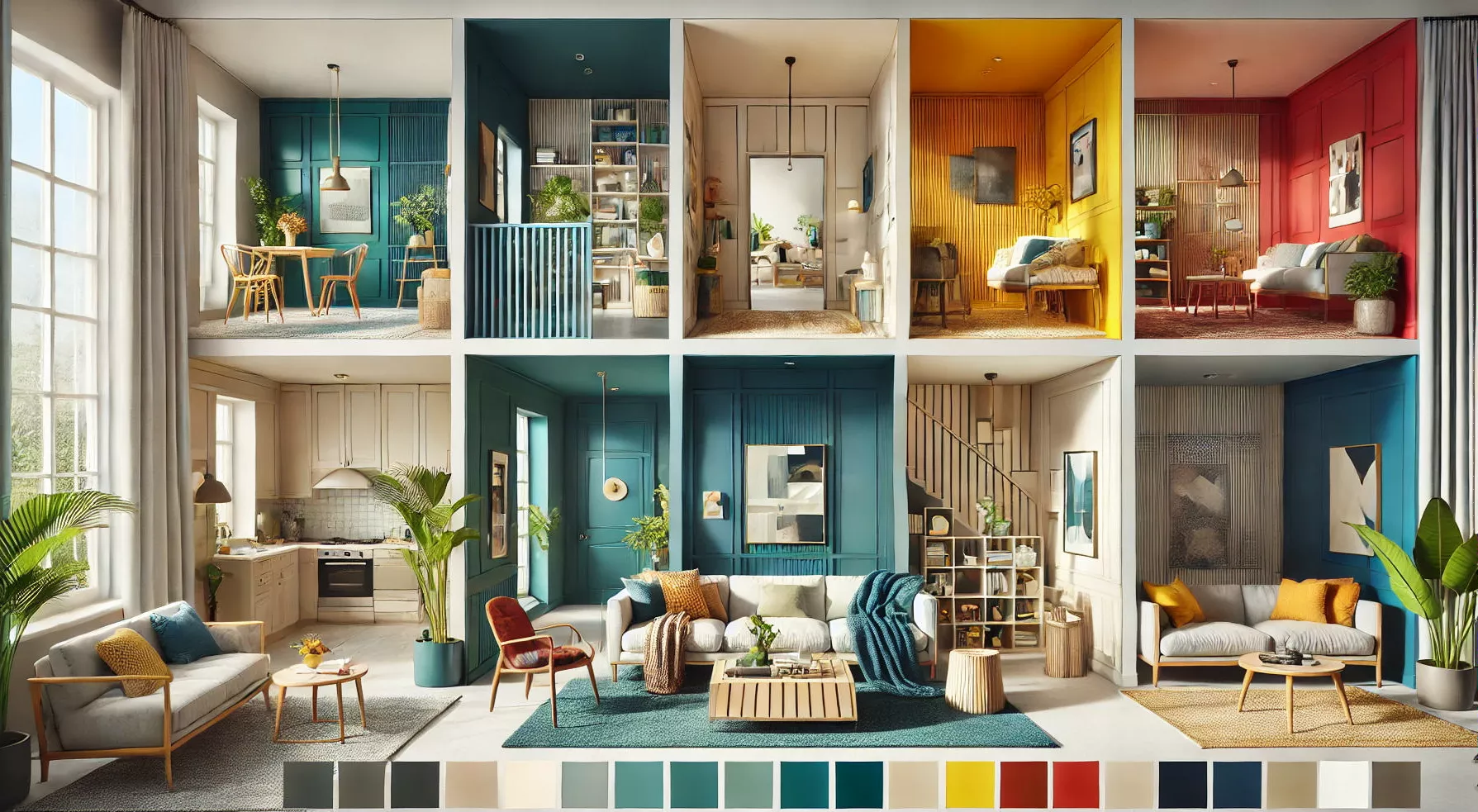
15 Two Colour Combination for Living Room
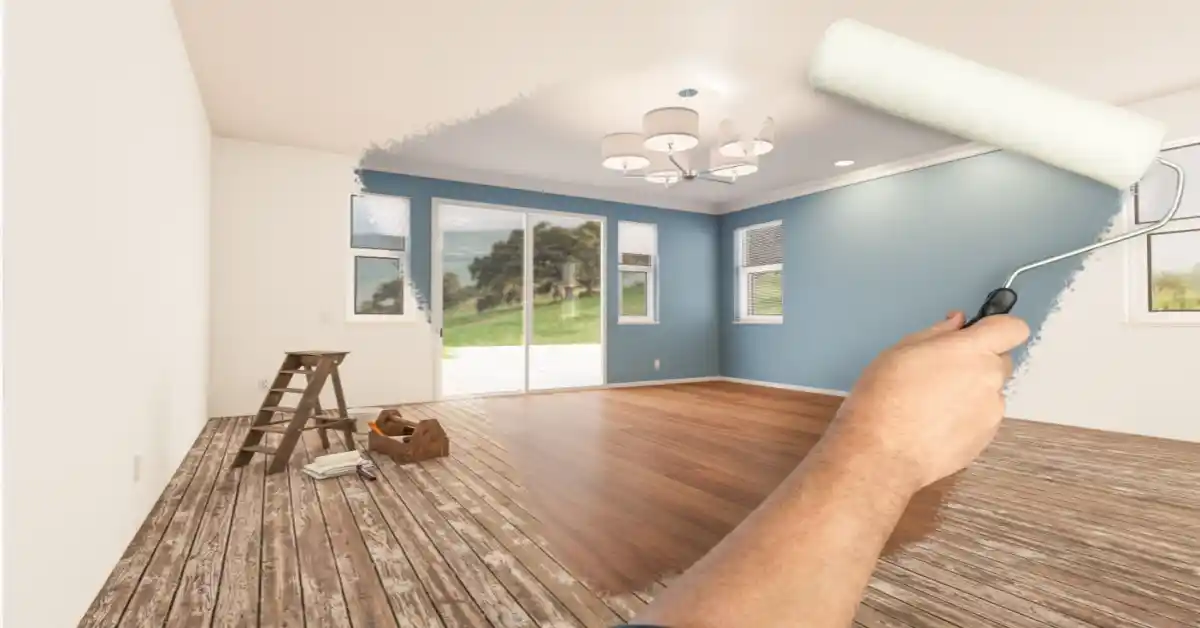
If you want two colour combinations for the living room – consider the tones before you begin with the colours. Do you want to create a room with warm or cold tones? The background with warm colours will have a reddish or orange tone (think buttery yellows, terracotta browns and deep maroons).
Cool tones will have a blue or violet background (some examples include silver-grey, sage green, and indigo).
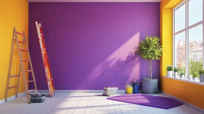
You can also choose contrasting two colour combinations for living room walls. Purple, for example, is the polar opposite of yellow. A cold turquoise blue pairs well with a warm olive green, and a cool light mauve can be used to set off a warm, fiery red.
To make your work easier, listed below are two colour combinations for the living room -
1. Green and Pink (Pastels)

Green two-colour combinations for the living room have gained popularity in recent years. But green is a strong colour in itself, therefore pairing it with other colours should be done with caution. You can opt for pastel green and pastel light pink. These colours in their subdued shades are the best two-colour combinations for the living room. Adding wooden accents would be a good bold move for the room.
Colour Codes: Green and Pink
- Green: #98FB98
- Pink: #FFB6C1
2 White and grey

Colour codes: White and Grey:
- White: #FFFFFF
- Grey: #808080
For several years, grey and white have been the most popular neutrals for Asian paints two-colour combinations for the living room, and their popularity shows no signs of decreasing. The colour, which was once associated with sadness and darkness, is now favoured by leading designers, who appreciate its versatility and beauty. The colour creates a stunning backdrop for any space, with far more depth than plain white. Style it with light coloured furniture to maintain the balance of the room.
3. Yellow and off White
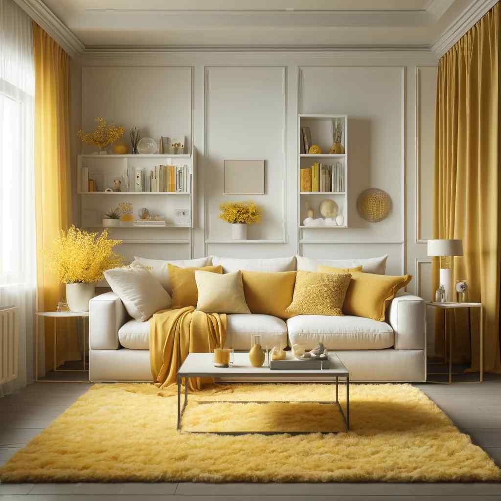
Colour codes: Yellow and Off White
- Yellow: #FFFF00
- Off White: #F5F5F5
Yellow and off white might seem strange for the living room two colour combinations for hall walls. But when these two are combined appropriately, they can elevate the look of a room. You could opt for a style, as shown above, textured off white wall as the central wall, yellow as its wingman.
4. Maroon and Pale Yellow
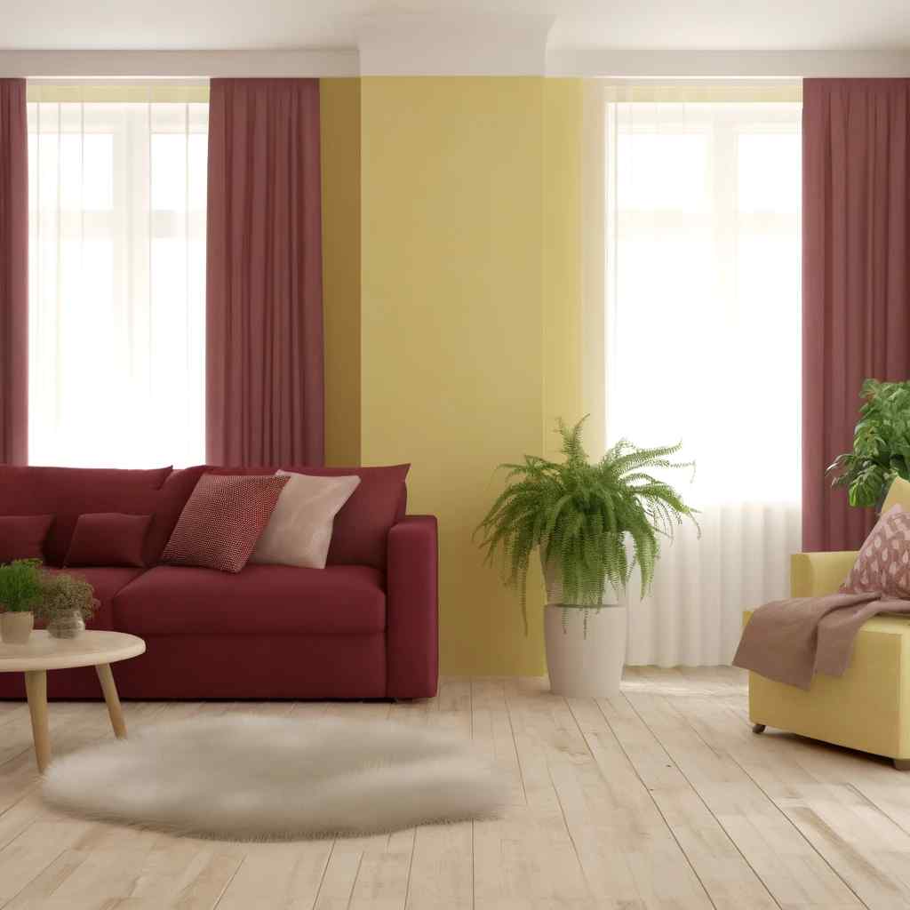
Colour codes: Maroon and Pale Yellow:
- Maroon: #800000
- Pale Yellow: #FFFF66
This two-colour combination for the hall is unique because the maroon offers a touch of royalty while the pale yellow keeps the air grounded. In front of the maroon wall, keep light coloured furniture. While for the pale-yellow corners, you can keep beautiful indoor plants.
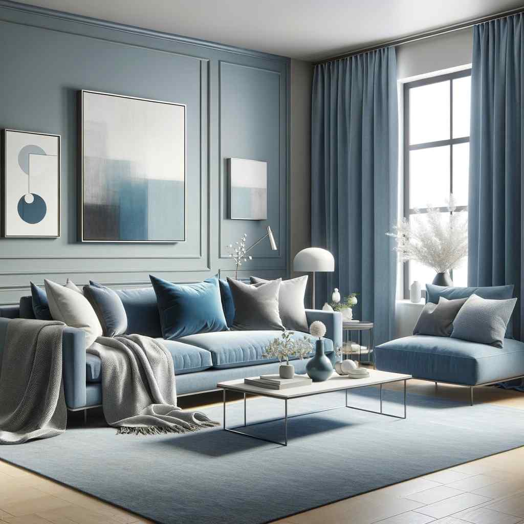
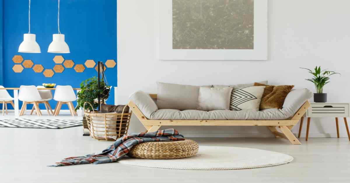
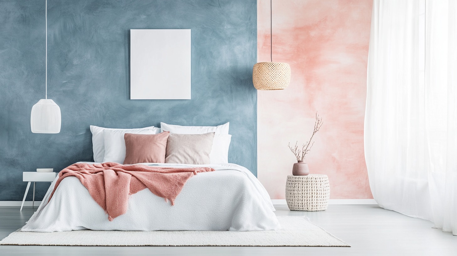
5. Blue on Blue (Light blue and Pastel dark blue)

Colour codes: Blue on Blue (Light Blue and Pastel Dark Blue):
- Light Blue: #ADD8E6
- Pastel Dark Blue: #4169E1
People often tend to neglect the corner that leads to the other floor. It is an important part of the living room that you must pay attention to. The above photo is a perfect example of how this corner can be transformed - blue on blue is a good two-colour combinations design for the living room. Keeping plants in the corner adds a fun touch.
6. Grey and white
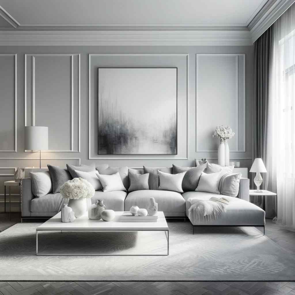
Colour codes: Grey and White:
- Grey: #808080
- White: #FFFFFF
The grey two-colour combination for the living room offers you a lot of options that you can choose from. Employ a pattern for the living room that has both grey and white like the above picture. It is a unique design and also works as a modern two-colour combination for the living room. With this design, you can select any shade of grey and can also customise the pattern of the design.
7. Brown and Navy Blue

Colour codes: Brown and Navy Blue
- Brown: #A52A2A
- Navy Blue: #000080
Do you have an open kitchen that is directly attached to your drawing room? If yes, then you know that it is an additional part of the drawing-room as it is clearly visible. Therefore, it is important to make sure that the kitchen also looks presentable. A good two-colour combination for a small living room is blue and brown. The photo above is a pure translation of the elegance that an open kitchen offers to the living room.
8. Blue And Pale Grey
Colour codes: Blue and Pale Grey:
- Blue: #0000FF
- Pale Grey: #D3D3D3
If you are looking for the latest two-colour combinations for the living room then blue and grey is your answer. If you have a drawing-room that has an amazing view, you can opt to style the living room as shown in the picture above. Make sure that one shade is lighter than the other, otherwise, it gives chaotic energy to the room.
9. Pink and White (Pastels)

Colour codes: Pink and White (Pastels):
- Pink: #FFC0CB
- White: #FFFFFF
This light two colour combination for the living room has been popular and has seen an increase in its usage. The colours may seem too common to use, but you can go for a different design. Like the picture above, you can add stark differences in the wall with the demarcation of the two colours. But make sure the furniture around this wall is minimal as it already creates a lot of contrast.
10. Pale Pink and Grey

Colour codes: Pale Pink and Grey:
- Pale Pink: #FFDAB9
- Grey: #808080
This two colours combination for the drawing-room wall is for the homes that have an inbuilt fireplace. The backdrop of the fireplace could be a pale pink wall with minimal aesthetics. While the fireplace could be a dark grey to add to the character of the area.
11. Indigo and pink

Colour codes: Indigo and Pink:
- Indigo: #4B0082
- Pink: #FFC0CB
The pink two colour combination for the living room pairs well with Indigo. The shade of indigo as seen in the picture above has a strong element. So, this shade could be used to accent a wall, while the other walls could be a shade of pale pink, resulting in a balance of ying-yang.
12. Dark Blue and Pastel Purple

Colour codes: Dark Blue and Pastel Purple:
- Dark Blue: #00008B
- Pastel Purple: #B0E0E6
This living room two colour combination will instantly give the room a luxurious feel. It is minimal in its touch but very effective. It is not necessary to follow the set norms of painting the walls, the picture above is a good inspiration to experiment actively to renovate your home. Add blue to the roof wall, while the lightest shade of purple can adorn the walls below.
13. White and Gold
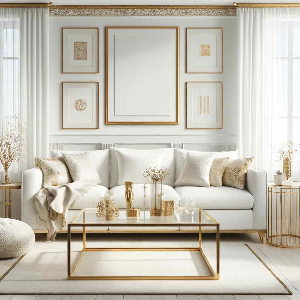
Colour codes: White and Gold:
- White: #FFFFFF
- Gold: #FFD700
If the thought of all-white minimalist décor does not appeal to you, white and gold is a timeless two wall colour combination for the living room. A two-tone colour scheme of white and beige can be used on the living room walls. The gold element can be added to the décor in the form of elegant light strips, mirrors, showpieces, and glass shelves to offer a touch of luxury. To add a touch of grandeur to your living room, try this trendy two-colour combination for the living room.
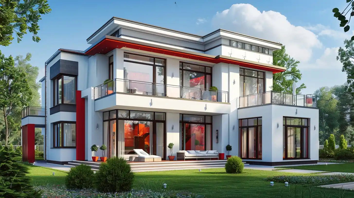
14. Red and Blue

Red and blue is a loud two-colour combination for the living room in India. You can opt for any shade of the colours, but the above picture employs the contrasting shades together, and surprisingly they fit in together. If you are opting for this combination, make sure you loop your interior designer so that extra care can be given to the furniture for the room.
Colour codes: Red and Blue:
- Red: #FF0000
- Blue: #0000FF
15. Pastel Orange and white
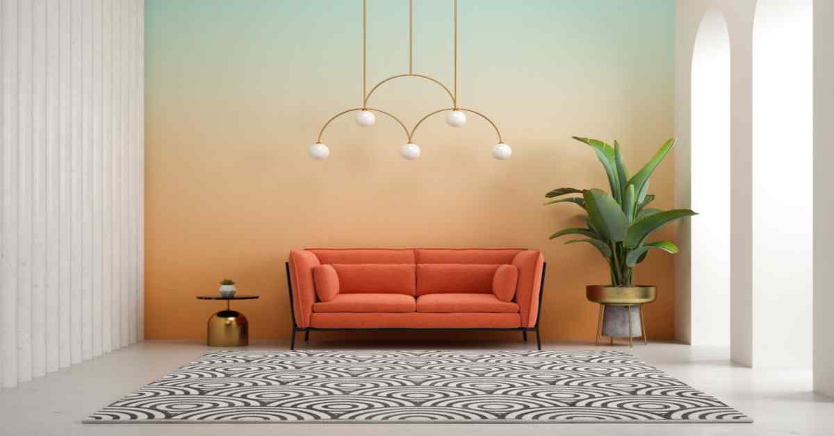
This is a simple two-colour combination for the living room, but what stands out is not the colour combination but the aesthetics of the furniture. The pattern of orange on the white wall gives the room a modern and comfortable vibe to it. The green couch adds to the character of the whole room.
Colour codes: Pastel Orange and White:
- Pastel Orange: #FFA07A
- White: #FFFFFF
Modern Hall Colour Combinations
Modern hall color combinations are all about creating a stylish and inviting space that reflects your personality and complements your interior decor. From bold and vibrant hues to soothing and serene shades, the options are endless when it comes to choosing the perfect color scheme for your hall.
1. Slate Grey and Burnt Orange
This combination merges the understated elegance of slate grey with the vibrant, energetic feel of burnt orange. It's a pairing that offers a sophisticated yet welcoming atmosphere, perfect for modern living rooms that aim for a balance between comfort and style. The slate grey acts as a neutral backdrop, allowing the burnt orange accents to pop, creating a space that's full of character and warmth.
Colour codes: Slate Grey and Burnt Orange
- Slate Grey: #708090
- Burnt Orange: #CC5500
2. Icy Blue and Soft Silver
For a living room that feels like a breath of fresh air, consider pairing icy blue with soft silver. This duo brings a serene, calming effect to the space, reminiscent of a crisp, clear winter sky. The icy blue offers a gentle splash of colour that's both refreshing and relaxing, while the soft silver accents contribute to a light, airy feel. This combination is ideal for creating a minimalist, tranquil space that feels open and spacious.
Colour codes: Icy Blue and Soft Silver:
- Icy Blue: #AFDBF5
- Soft Silver: #C0C0C0
3. Charcoal Black and Metallic Copper

To infuse your living room with a touch of modern luxury and drama, charcoal black paired with metallic copper is an excellent choice. The deep, rich tones of charcoal black provide a dramatic and sophisticated backdrop, allowing the metallic copper accents to shine and bring warmth to the room.
This pairing is perfect for those looking to make a bold statement while maintaining an air of refined elegance. The contrast between the dark charcoal and the shimmering copper creates a dynamic, visually striking space that's sure to impress.
Colour codes: Charcoal Black and Metallic Copper
- Charcoal Black: #333333
- Metallic Copper: #B87333
4. Warm Taupe and Rich Teal
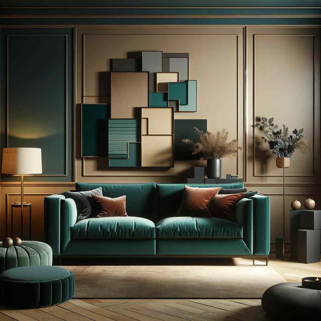
This pairing combines the soothing neutrality of warm taupe with the deep, vibrant hue of rich teal. Warm taupe serves as a versatile and comforting base, adaptable to various decor styles, from minimalist to eclectic. The introduction of rich teal accents brings a splash of sophisticated colour, adding depth and a touch of luxury.
This colour combination is ideal for those seeking to create a serene yet expressive living environment, where the warmth of taupe and the boldness of teal complement each other to form a harmonious and inviting space.
Colour codes: Warm Taupe and Rich Teal
- Warm Taupe: #B38B6D
- Rich Teal: #00808
5. Soft Lavender and Creamy White

For a living room that exudes softness and tranquillity, pairing soft lavender with creamy white is a beautiful choice. Soft lavender, with its subtle, soothing presence, adds a gentle touch of colour that inspires relaxation and creativity. Paired with the clean, expansive feel of creamy white, this combination creates a light, airy space that feels both cosy and spacious.
It's perfect for achieving a modern, understated elegance, with a hint of romantic charm. The soft lavender and creamy white duo is excellent for those who appreciate a minimalist aesthetic with a twist of gentle colour.
Pro-Tips for Wall's Two-Colour Combinations for the Living Room
- Using a neutral colour as the backdrop and a bright colour from the same colour shade as the accent colour is a simple way to integrate 2 colour combinations for the living room. (Think dazzling white with forest green edges or crisp white with indigo integrated strategically as a neutral background for cool-toned colours).
- You can also add an accent wall, which is a wall that is painted a different colour than the rest of the room. You can add the accent colour to the ceiling for an unexpected touch!
- Alternatively, you can use textured paint to produce a fun colour-on-colour effect. The main rule for pattern decorating is that you can use more than one pattern in a room – which is acceptable – but never more than three. So, patterns like chevron stripes or polka dots can be added to a wall, but don't go overboard with them.
- Take inspiration from art, travel, and even ads; Coca-classic Cola's white-on-red logo is a good example. You could even go black and white if you're feeling very daring! Consider colours that are meaningful to you; the end result should be a representation of your personal style.
Two-Toned Furnishings
If you are not interested in the combination of two colours for your living room, then we have a solution for you. Your furniture can also do the job! Listed below are tips on how to add colour to your living room with the help of two-colour furnishings.
Contrast Colours
Add two-colour furnishings to the living room for an easy way to add colour – for example, match the drapes to the sofa upholstery and use contrasting pillows. Alternatively, if your upholstery is a neutral colour like grey, white, beige, or black, consider matching the carpeting with cushions.
Contrasting Curtains
Curtains in two opposing colours are a good start, and you may add other pieces in those two colours later. In this manner, your room's background – the walls, huge pieces of furniture, and woodwork – can still be classic and neutral while still including the two-colour tale.
Two-Toned Paintings
Paintings in two tones are also available - you can also use contrasting colours here. A space with too many colours can appear cluttered. Using only two tones for all of your furnishings will give the area a coherent look.
Same Colour - Different Textures
Use the same colour in different textures to create an interesting area—for example, a smooth silk cushion paired with a woven carpet in the same colour looks stylish.
Pop-Coloured Furniture
Keeping the remainder of the space somewhat neutral and opting for vividly coloured furniture items is a dramatic approach to embrace the two-colour trend. In front of a grey wall, a lush velvet sofa in emerald green would pop. A red chair would look great in a white room if you are not opting for two colour combinations for the drawing room.
Explore Living Room Colour Combination Ideas
The living room has the potential to become the most stylish space in the house. The two-toned style is resurfacing, and you can incorporate it into your living room in a variety of ways. Now that vaccination drives have reopened the world and we can finally call friends home again, why not give the living room a makeover of the two-colour combination of your living room? If you need assistance, NoBroker is the answer. Drop a comment down below and the executive will reach you shortly.
Frequently Asked Questions
Ans. To brighten up your living area - choose a cheery yellow, purple, pink, beige, or soothing green.
Ans. Some of the best colour combinations for a living room include purple and pink, teal with white, yellow with grey, yellow with blue, green with teal, and brown with white.
Ans. Yellow with grey, brown with white, classic black & white, teal with white, and red with purple colour are the best two colour combinations for the living room.
Ans. White and gold, blue and yellow, yellow and grey, mint green with teal, and green with white are two colour combinations for the living room that will be popular in 2022.
Ans. A light paint colour palette combined with a neutral colour palette can make a room appear larger. Dark colours absorb light and make the area feel smaller, whilst bright and gorgeous light walls can make the space appear airy and open.
Recommended Reading

12 Best Painting Contractors In Chennai: Top Leading Brands and Suppliers in 2026
April 6, 2025
10986+ views
Top 12 Painting Contractors in Bangalore in India: Leading Brands and Suppliers 2026
April 6, 2025
10352+ views

12 Best Painting Contractors in Pune for Homes, Offices, and Commercial Spaces in 2026
April 5, 2025
10066+ views
Top 12 Rated Painting Contractors in Delhi for Home and Commercial Buildings 2026
April 4, 2025
10049+ views

12 Best Painting Contractors In Mumbai: Expert Services for Homes, Businesses, and Industries 2026
April 5, 2025
8996+ views
NoBroker Painting Tips & Color Ideas Testimonials
Before this festive season
get your house painted
Most Viewed Articles
40+ Best Stunning Two Colour Combinations for Bedroom Walls to Elevate Your Space in 2026
January 31, 2025
336108+ views
Top 25 Outside Color Combinations with Colour Codes for Indian Homes in 2026
May 16, 2025
311898+ views
Asian Paint Price 20 Litre for Different Variants in India: Coverage, Durability and Benefits
May 17, 2025
174998+ views
25 Latest Main Gate Colour Combination Ideas: Direction and Placement as Per Vastu in 2026
October 9, 2025
157156+ views
Top 26 Wall Paint Colour Combinations Ideas With Codes for Every Room in 2026
February 3, 2025
136436+ views
Painting Services in Top Cities of India
Top Paint Brands Price in India
| Asian Paints Price | Nerolac Paints Price |
| Berger Paints Price | Dulux Paints Price |
| Nippon Paints Price | Shalimar Paints Price |
| Indigo Paints Price |
 Author
Loved what you read? Share it with others!
Recent blogs in
Best Colour for Home Exterior Based on Climate, Style and Modern Design with Colour Codes in 2026
February 19, 2026 by Priyanka Saha
Radium Paint for Walls: Types, Application and Protective Features in 2026
February 19, 2026 by Priyanka Saha
10 Best Brick Wall Painting Texture Design for Modern and Rustic Homes in 2026
February 19, 2026 by Krishnanunni H M


 Full RM + FRM support


Join the conversation!